UX DESIGNER
I led NHL 16's UX design, focusing on improving the efficiency of key tasks while designing game modes and features to fit into a tile-based interaction model and re-thinking player learning systems.
Axure RP, Quartz Composer, Photoshop, Illustrator, Perforce, Actionscript, Lua, Pen & Paper
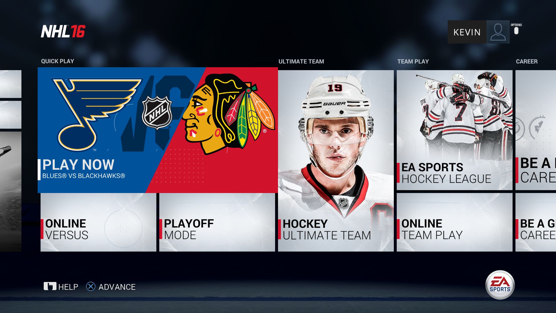
The homepage design we adopted for NHL 15 was consistent with other EA SPORTS titles but it hid most of the game modes - the most important content - on the second tab. I set out to design a new homepage that was more efficient to navigate, put the game modes front-and-center, and still adhered to the tile-based interaction model we adopted previously.
NHL has a complex control scheme that may be daunting for new players. I provided design and prorotyping support for the NHL On-Ice Trainer system which aimed to teach players the complex controls of the game in real-time. Our two goals were: to ensure that new players could pick up the game and win within their first two games; and that veteran players would also get lasting value of the feature.
As more features were added to the game, I set out to create templates for game mode hubs and customization tools so that new content could be added modularly and that all areas of the Creation Zone tools worked in consistent ways.
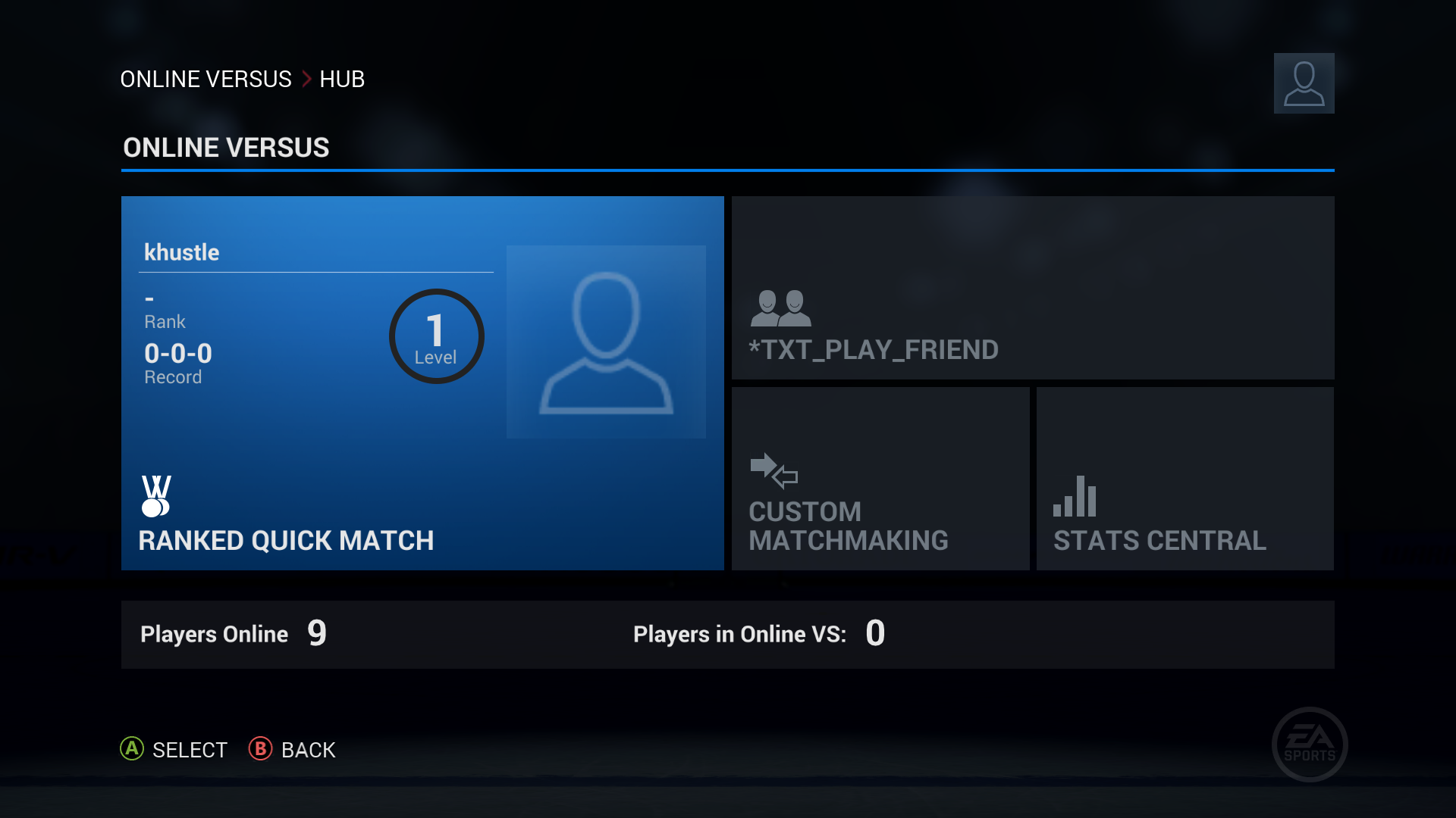
Working closely with the online Producers, I helped design the new EA SPORTS Hockey League mode which we decided to center around competitive online team play. Designing this mode was a major challenge both in game design and interaction design, as some screens require up to 12 players to use features simultaneously.
After implementing a tile-based interaction model in NHL 15, our art director and visual designers set out to refine the look and feel by moving towards a flat design. While I worked to reduce and simplify the main menu's layout and information architecture, the visual designers came up with a bright white tile design which incorporates accents based on your favourite team's colours.
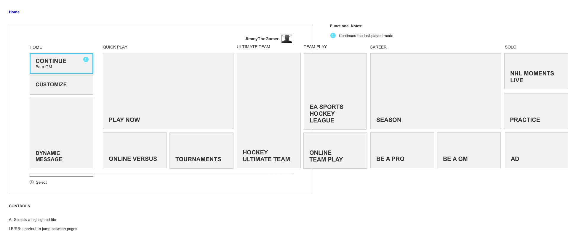
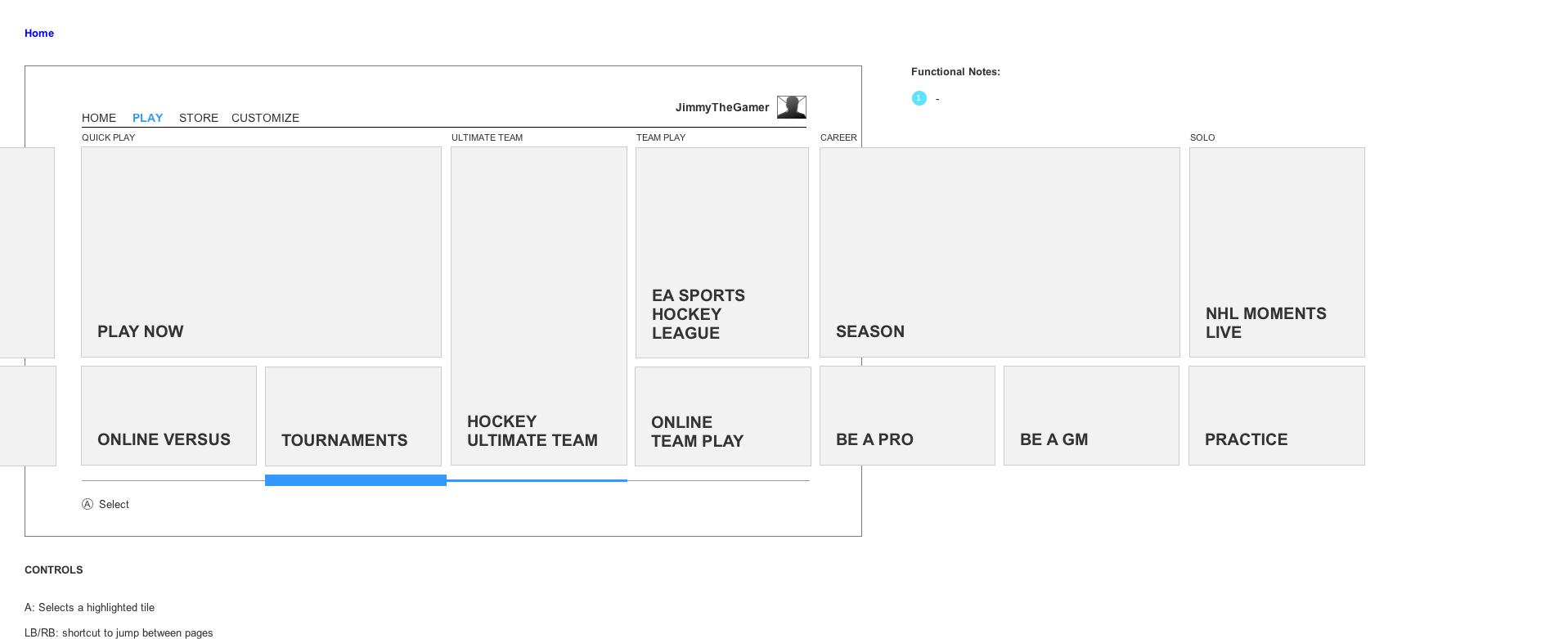
My overarching goal for NHL 16 was to improve the efficiency of menu navigation. This effort started with a new main menu design, for which you can see an artist's final mockup below. I proposed eliminating the tabs present in NHL 15 and reducing "Home" to a single-column sliver.
I spent a lot of time sketching and wireframing options for the new Main Menu. My ideas focused on minimizing the amount of space and time that non-essential content took up, while maximizing the presentation and efficiency of navigating through game modes. Eventually I landed on the idea of a small "sliver" of content that would contain things such as a Continue option or advertising space, followed by a large area containing tiles for all of the game modes. These are just two examples of wireframes I did - one without tabs, and one with tabs.
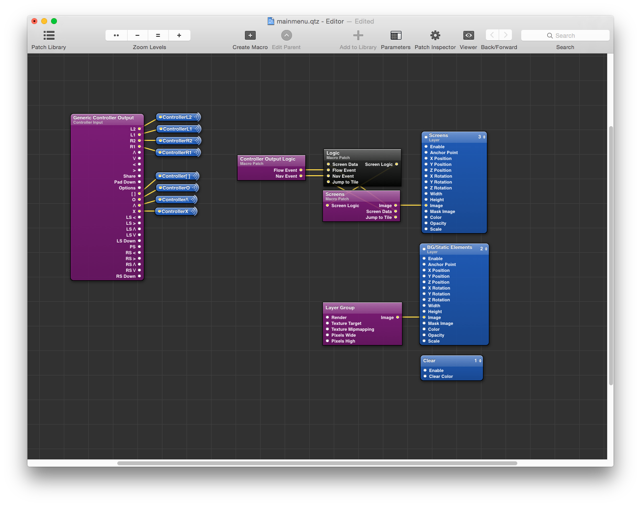
After I and the visual designers did a few iterations, I created a fully functional prototype in Quartz Composer in order to communicate the interactions and animations I had in mind. I had a specific vision for when the content should animate and how the bumpers on the controller could continue to act as shortcuts in this design. The prototype also allowed us to run it through usability testing before implementing it in the game. You can see a video of the prototype below in the Result section.
When we measured the efficiency of the new design, it tested faster overall. Additionally, study participants generally noted that they liked the aesthetics and found it easier to navigate. With the prototype created and positive feedback from User Research, we decided to implement the design.
"As you guys can see, it’s much smoother. This is what I found anyways - it’s a lot faster (the main menu). It’s all one menu, it’s all sleek, you can literally just go through the entire thing all at one time. It’s much nicer."
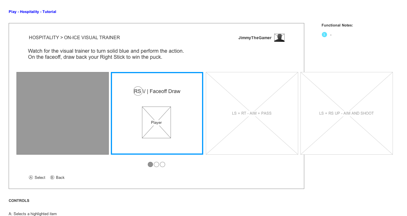
We knew that NHL games can have a steep learning curve for controls and for hockey knowledge. I provided design support for the NHL On-Ice Trainer which was intended to address this problem. We recognized that not all players will want to play a tutorial, and instead many will jump straight into their first game. So without burdening players with up-front tutorials, we designed a responsive system that provides help at the moment it's needed without distracting from gameplay.
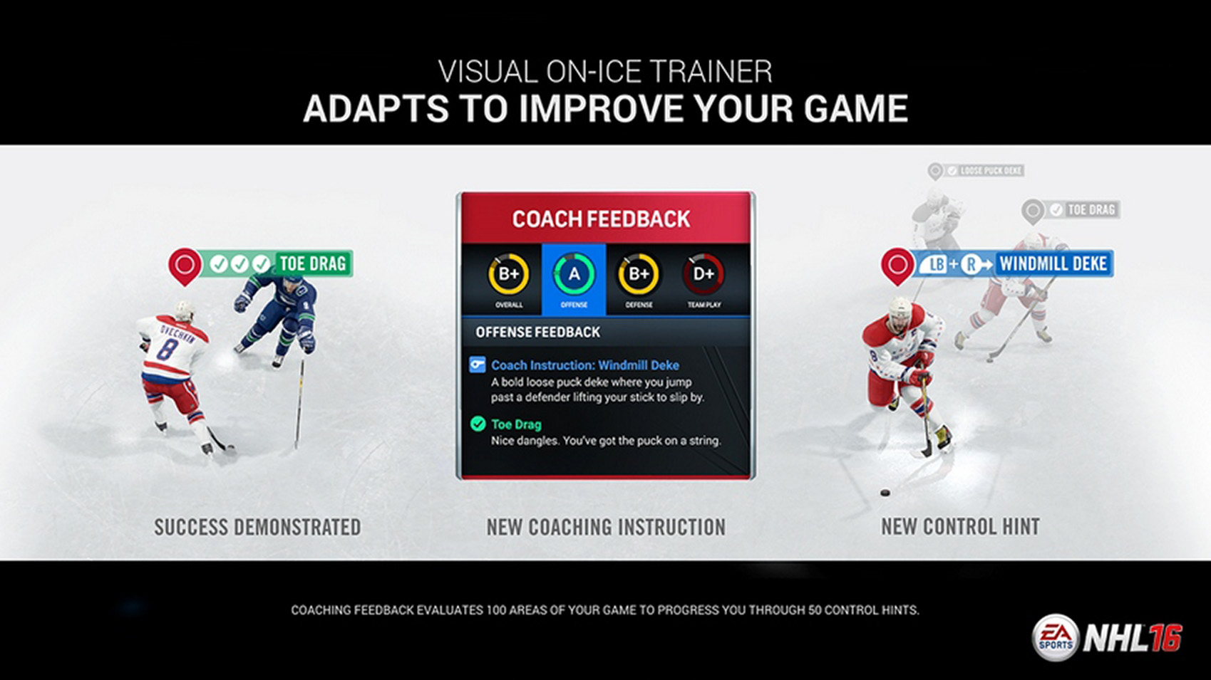
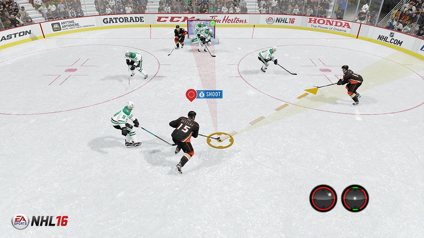
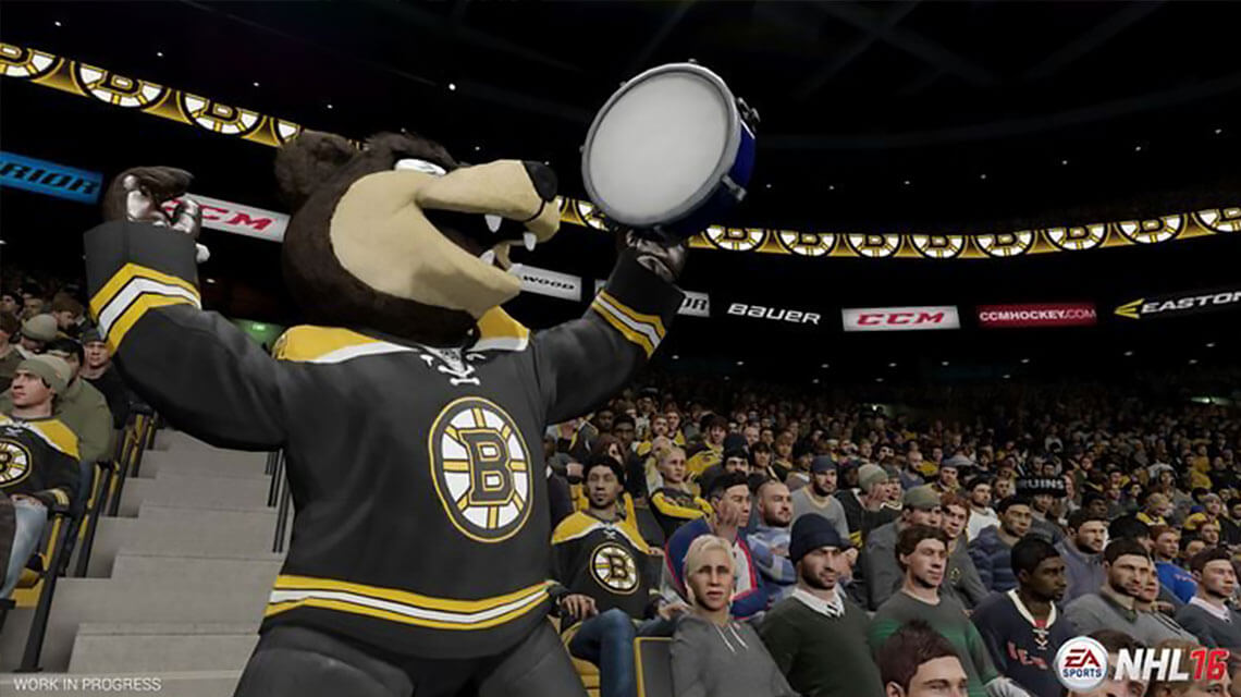
Learning often happens best when it's provided at the moment it's needed, so the trainer provides both control hints and visualizations when the context is right. For example, in the screenshot here you can see it's providing the control for "Shoot" because the player is near the net. It's also highlighting an open teammate that could receive a pass, and it's mapping open areas on the net where a shot might go in.
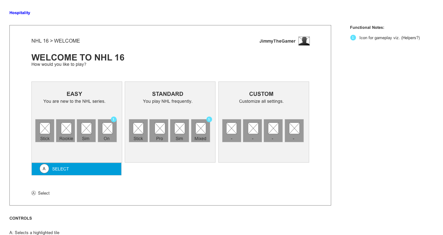
In addition to providing design support, I created some wireframes showing how the trainer could be integrated into the game at large. Here I was exploring what should happen the first time you boot up the game - perhaps it shows you a few key controls right away, or perhaps we could integrate the trainer into the existing "hospitality" flow.
In the Be a Pro mode, you receive tips and XP from the coach that relate to your progression throughout the mode. UI in the corner of the HUD used to communicate this information. I proposed merging these systems with the Trainer so that the player's eye would more likely be where the XP gains were. I created a prototype using art assets from the artists' mockups in Quartz Composer, exploring the rules for doing so.
Initial user research on this feature yielded extremely promising results. Simply by showing controls which floated near your skater, we were able to get new players up to speed very quickly. Reviewer reception of the Trainer has been exceptionally good, with even veteran players praising it for telling them things they never knew.
"EA Canada pulled it off, bringing back most of the features that were missing in NHL 15 while delivering important upgrades to the way the game is played. (Seriously, the On-Ice Trainer is my favorite innovation of 2015.)"
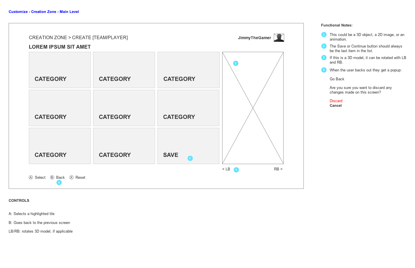
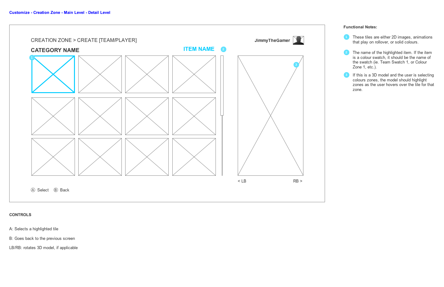
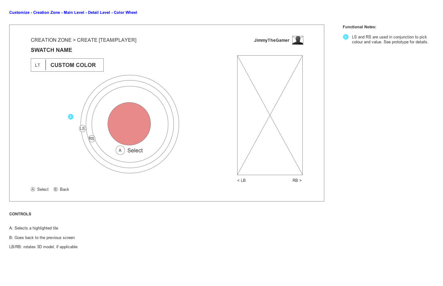
The Creation Zone feature has dozens areas of customization and nearly unlimited combinations of options. In order to reduce the number of one-off designs we'd have to do, and to empower the art team to add new customization options quickly, I created templates and flexible information architecture diagrams which guided our software engineers when implementing these features. Additionally, I proposed using common visual language in the game mode hubs in order to signpost to users that they've entered the main screen of a game mode.
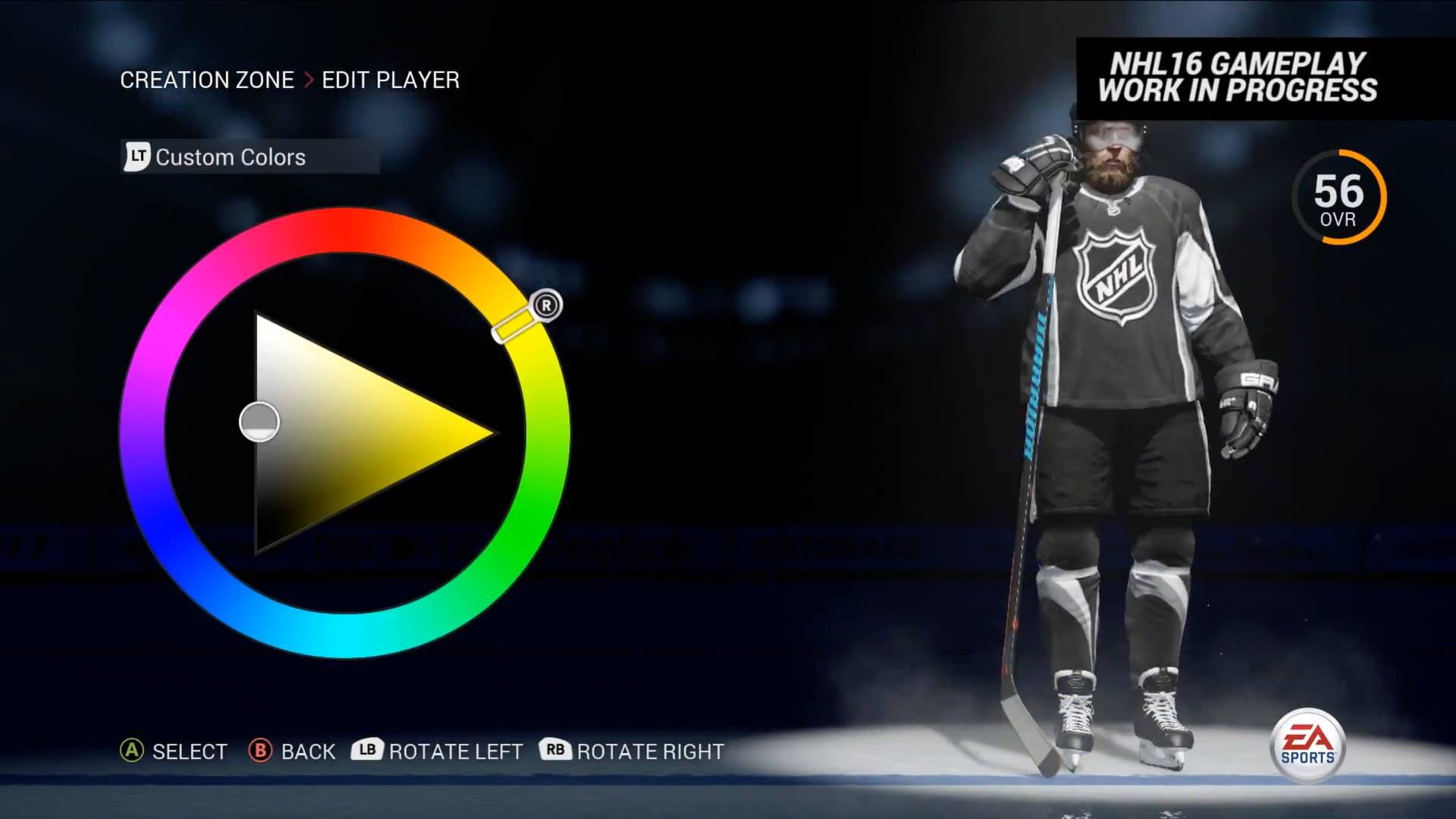
I took some time to collaboratively whiteboard the different screen types we might need based on the variety of content we were planning to have. Here you can see some ideas around swatches, colors, selecting items, color wheels, and more.

Throughout development, I kept an updated diagram of all the content we wanted to add to Creation Zone, organized logically and tagged by content type. Some things were simply an item choice, like which Jersey Font you wanted, some were simply a color, like the color of your stadium walls, and some were both, like which socks your skater should be wearing.
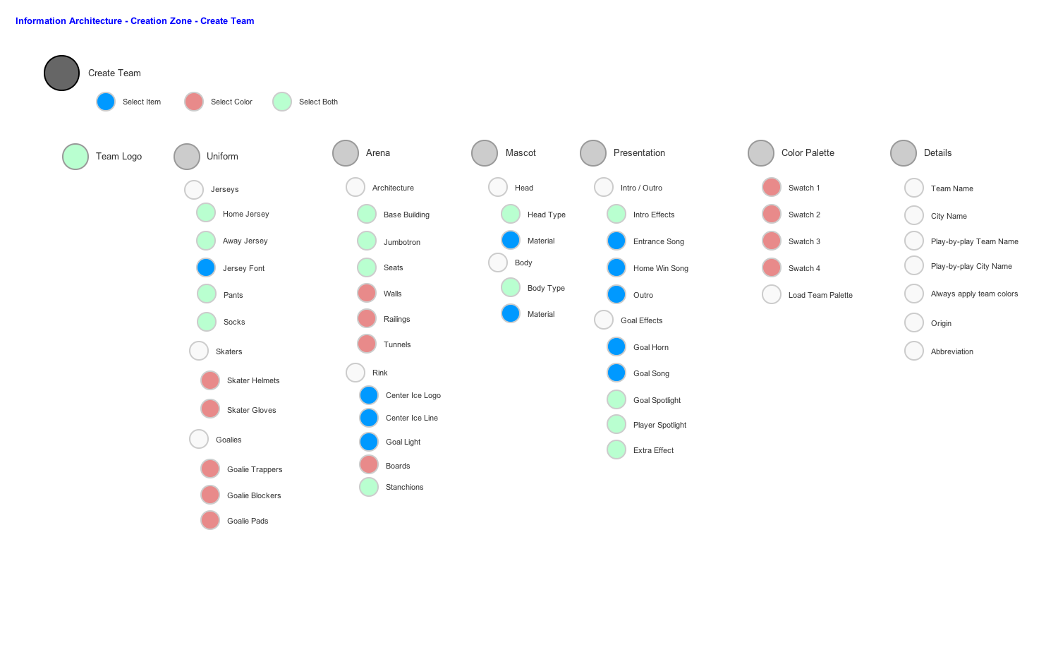
The content types defined above mapped to template wireframes, some of which you can see below. For example, you can see a Main Level category, a Detail Item chooser, and a Color Wheel chooser.
Here you can see how the artists updated the visual language of various game mode hubs, which helps signpost users as to where they are in the overall flow. We made sure that each hub had a blue underline and a visible title to indicate these weren't just another screen in the flow - they were the main landing pages for a full game mode.
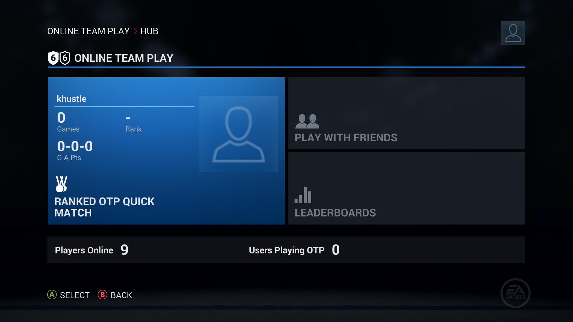
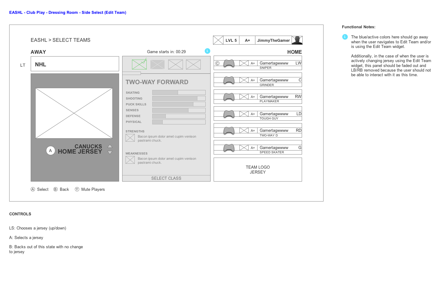
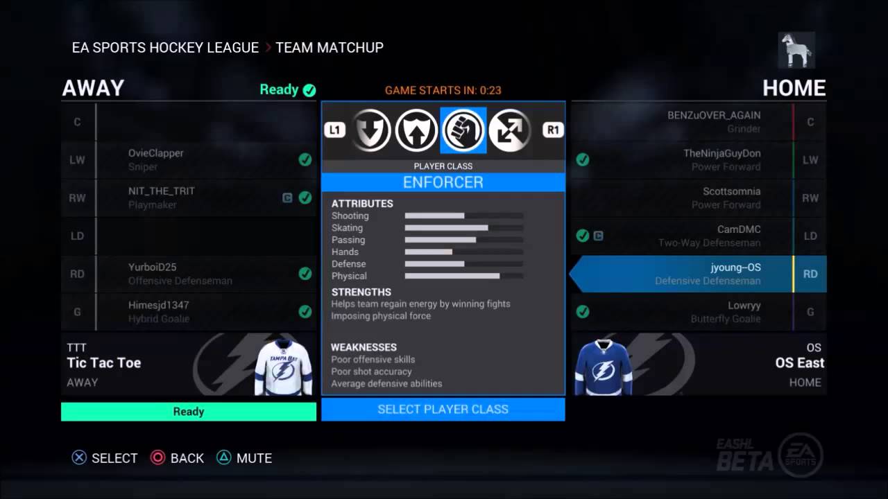
I provided both game design and UX support for the new EA SPORTS Hockey League. We first decided on pillars for the mode - such as the idea that player skill should usually be the determining factor instead of upgrades or abilities, and that team coordination should be key to success - and then we prototyped player classes and UI flows.
One of the biggest challenges to tackle was the flow going from the dressing room to the side-select screen, where up to 12 players need to choose a player class and various team captains can change game settings. I was ultimately able to devise a design that allowed us to share code with the existing Online Team Play screen. Pressing A would advance you through selections of team, position and jersey, while bumpers would allow changing player class. When we ran an interactive version of this flow through user research, we were happy to discover that the interactions were very clear and few people had any usability issues with it.
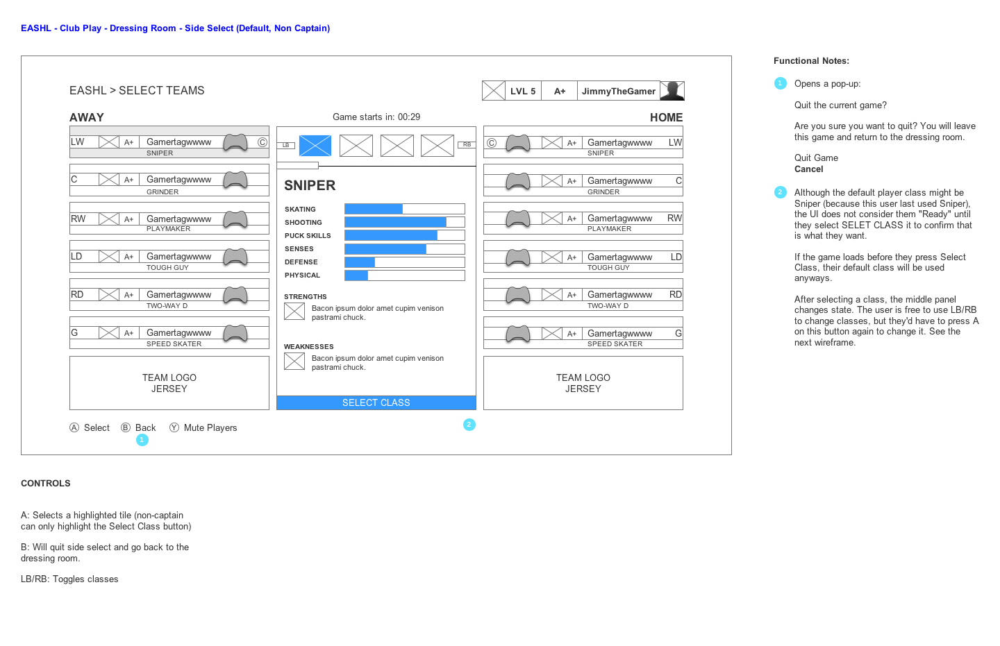
In the screenshot below you can also see the idea of player classes. This was a direction we took after deciding on the pillars for the mode as well as doing research with the community. Once we knew that we wanted games to have relatively even playing fields, we focused on the idea of having players choose classes and the fact that team composition would be an important strategy in the new EASHL. The response to the new EASHL has been generally quite positive, with many players and reviewers noting that it makes the game more skill-based than before.
"The most fun way to play NHL 16 is undoubtedly EA Sports Hockey League...It returns in a big way, thanks to a more user-friendly way to drop in and play anytime as well as a smart new team-building mechanic. Before each game, players choose the type of player they want to be; options include sniper, two-way player, playmaker, and others. The mixing-and-matching keeps every game interesting and guarantees that team skill influences winning and losing more than anything else."
NHL 16 was a big challenge, as we set out to add many large features to the game in addition to totally re-thinking learning systems with the On-Ice Trainer. I am humbled that response to our efforts have been so positive. From UI responsiveness and efficiency, to the training visualizations, to the new class-based EASHL, I'm proud of our work in NHL 16.
"One of the best features in NHL 16 is the On-Ice trainer, letting you play through the game and get to grips with the basics rather than the usual brief tutorial mode...Unlike the previous iterations (of EASHL), which allowed boosting through micro-transactions, player abilities are now dictated by the class selected, ensuring that those of us with disposable incomes don’t gain an unfair advantage...With a gentle learning curve, tight mechanics and immensely gratifying gameplay, I personally feel that NHL 16 stands as EA SPORTS’ most accomplished release of the year...I couldn’t recommend it enough."
UX Designer, Electronic Arts
Ian Chan, Garrett Knights, Stephen Wolynsky, Ron Slychuk, Adam Barnett
Check out the game at easports.com
Let's talk shop! Feel free to shoot me an email about what you see here, future work, or anything else you'd like to chat about.
EMAIL ME