UX DESIGNER

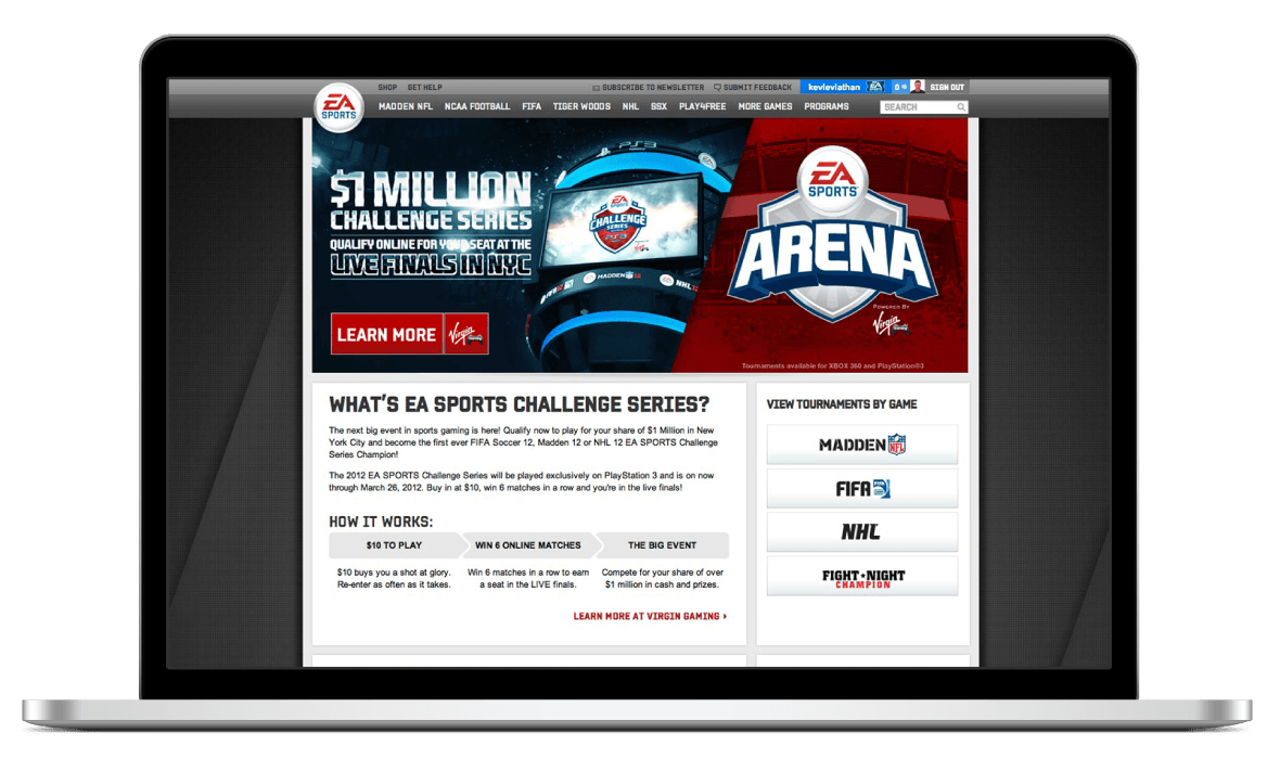
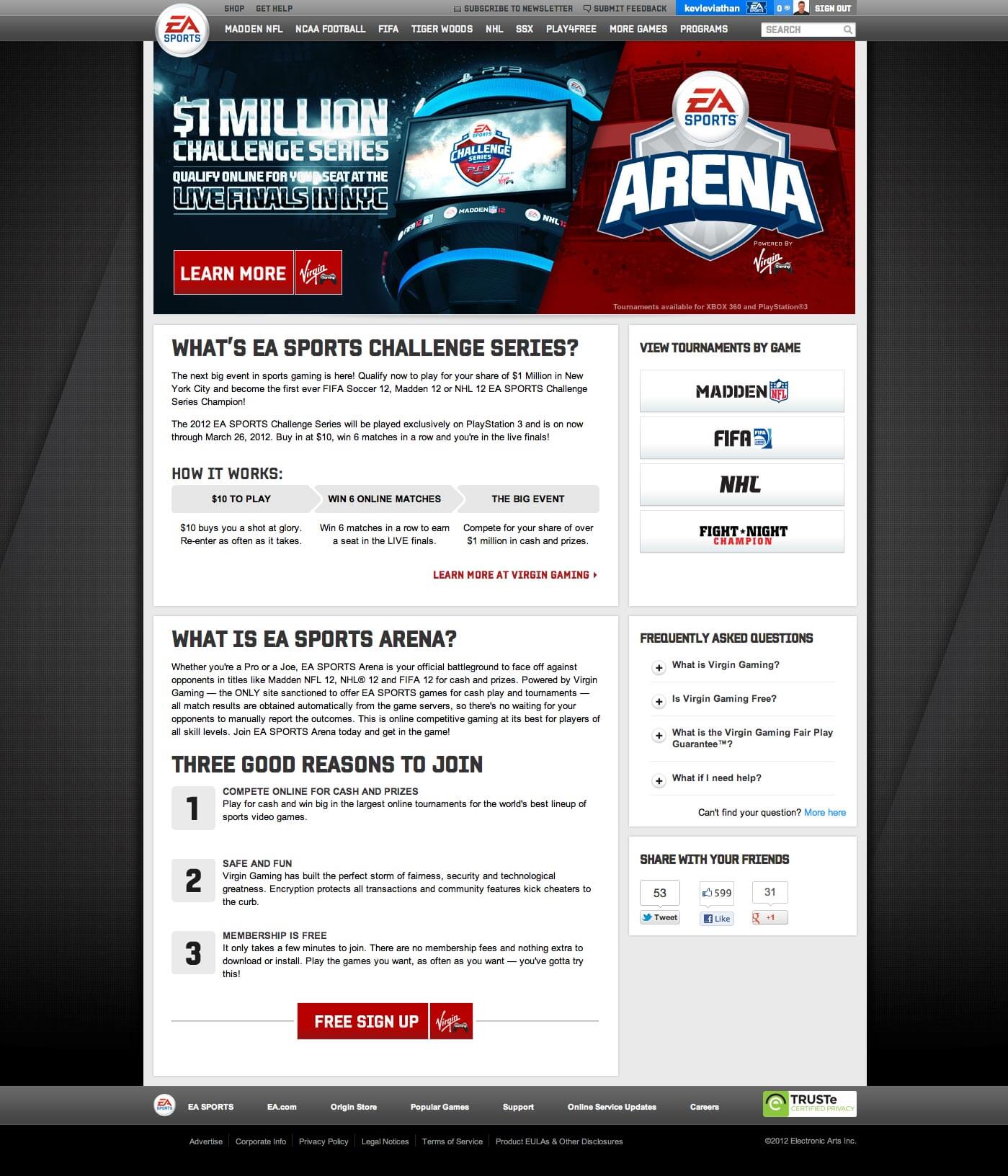
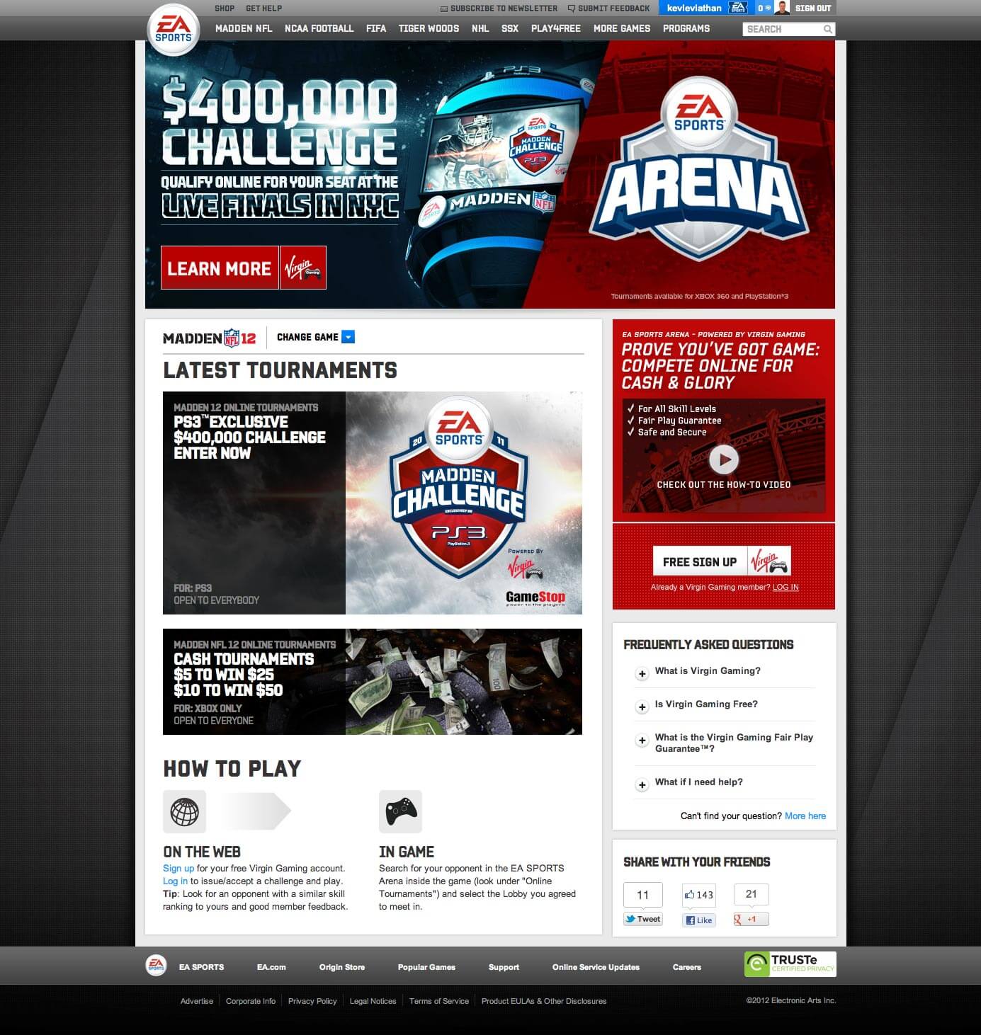
I was tasked to create wireframes for an EA SPORTS Arena microsite. The purpose of this site was to drive people to sign up for Virgin Gaming, EA's partner site. The final screenshots below were created by visual designers based on my wireframes.
Tools: Pen & Paper, Omnigraffle
Because we were working with a partner site, the Arena website didn't directly link to a sign up form. Due to this, I decided to use a prominent "Learn More" button to drive traffic to the Virgin Gaming site. Additionally, I added secondary CTA's in the form of links to game-specific pages. Our hypothesis was that FIFA fans would be more convinced to sign up on a FIFA-specific page, rather than a generic one.
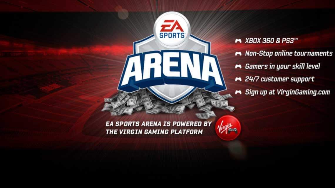
There was some confusion about the details of this feature because two different brands were involved. Additionally, the concept of spending money to enter competitive gaming tournaments is new to most North American gamers. I was careful to design a brand hierarchy on each page - having the EA SPORTS medallion in the header, the Arena branding in the hero image, and a "powered by Virgin Gaming" logo attached to the Learn More CTA. This was intended to signal to the user that by clicking Learn More, they will be taken away from the EA SPORTS Website.
UX Designer, Electronic Arts
Mark Magnusson, Marc-Oliver Gern
See a video of how it works on YouTube
Let's talk shop! Feel free to shoot me an email about what you see here, future work, or anything else you'd like to chat about.
EMAIL ME