UX & VISUAL DESIGNER
Autobahn Adventures came to us with the need to re-design their website in order to update the look & feel as well as to improve conversions of customers who book vacations with them. This was an especially cool project to work on due to the high-end nature of their vacation offerings and the amazing photographs they have accumulated over the years.
Tools: Axure, Illustrator
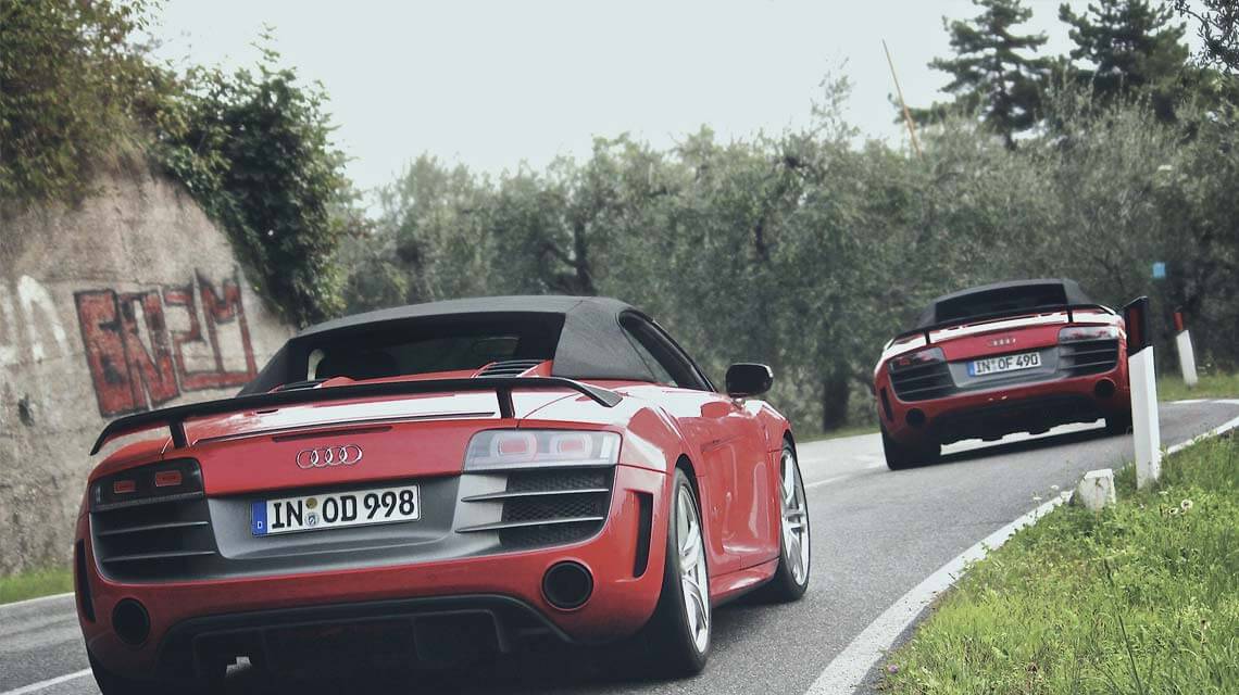
When re-designing the Autobahn Adventures website, I tried to address three main design problems: clearly communicating the content and vacation offerings, enabling deep exploration of content to build trust, and to improve the registration process for higher conversion rates.
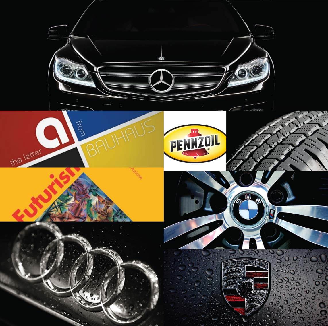
Before embarking on any detailed design work, I took a high level stab at what the new Autobahn Adventures website should look and feel like. To do this, I gathered inspiration from the Bauhaus movement and prepared a mood board alongside colour and typography guidelines.
UX documentation consisted of two main deliverables: a revamped information architecture and wireframes for each page type. The information architecture helped address organization and navigation problems with the website, while the wireframes started to define page layouts and widgets.
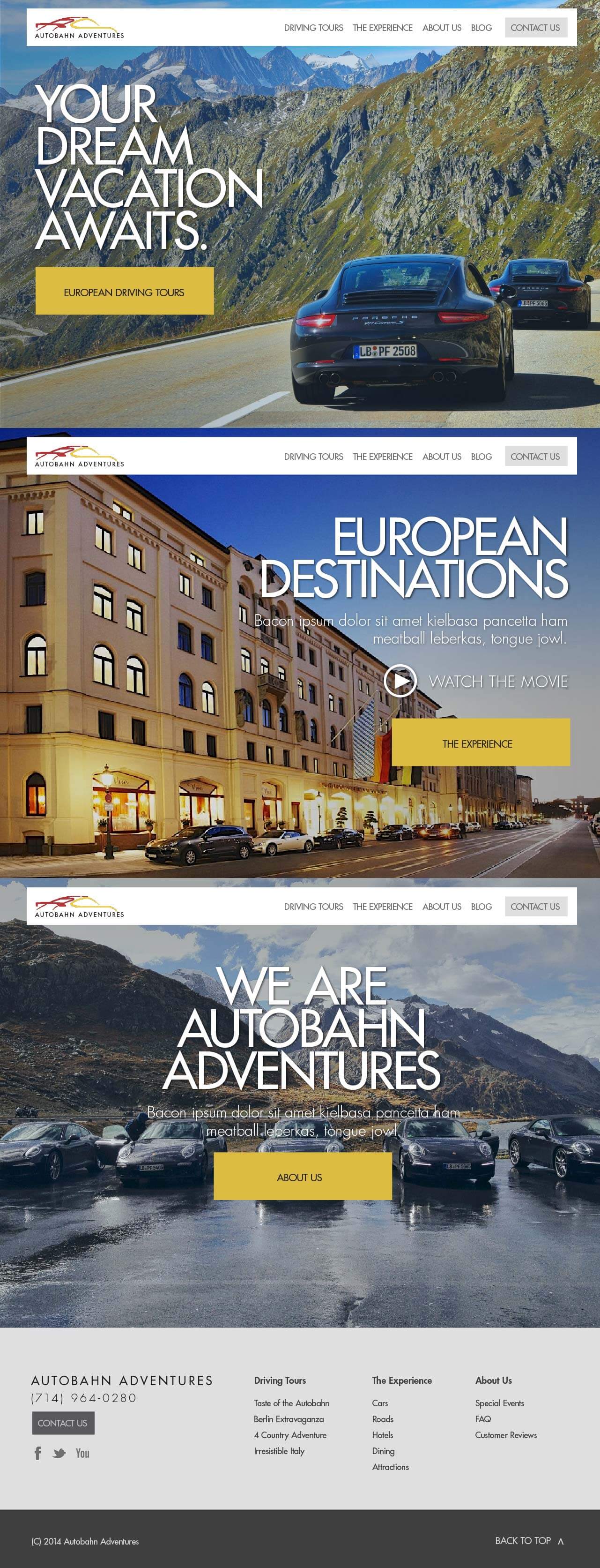
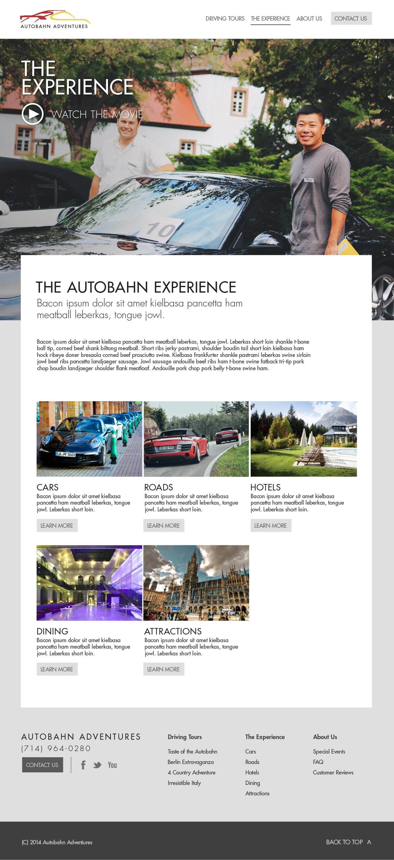
Finally, I created full visual mock-ups of all of the site's major pages. To do this, I used the wireframes as reference and applied the new look & feel to them while incorporating some of the awesome photography available to me.
Here I collected some images of cars, logos, and designs derived from the Bauhaus movement. I chose to look at this movement because it is so closely tied to modern design, European car manufacturers, and the overall ethos of the Autobahn Adventures brand. Many of the recurring palettes feature reds and yellows, which are the Autobahn Adventures brand colours.
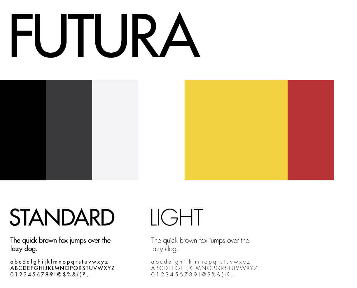
I slightly tweaked the Autobahn Adventures colours to be less harsh. I selected yellow as the primary highlight colour, with dark red providing secondary accents when necessary. I selected Futura as the typeface because it comes directly from the Bauhaus movement and provides an excellent balance of personality and readability.
The old information architecture had eight top-level categories. I scaled this down to six categories by placing FAQ under About Us, and by removing the 'Gallery' page entirely. Instead, image galleries are now presented on each page in context of the vacation package the user is looking at. Lastly, I renamed European Tours to Driving Tours because some packages now happen outside of Europe and Driving Tours is a more explicit name for the content it holds.

The Autobahn customer base skews towards older couples with higher than average disposable income, and the site sees lots of iPad usage. The homepage's use of large images with text and touch-friendly calls to action should make it easier for those customers to interact with the site. Other pages follow a similar template, but allow for more text, images, and other widgets below the hero image. Lastly, since most sales are currently initiated via phone call or email, I designed the Contact Us menu item to stand out with its own button so that users would not be confused or hesitate to reach out.
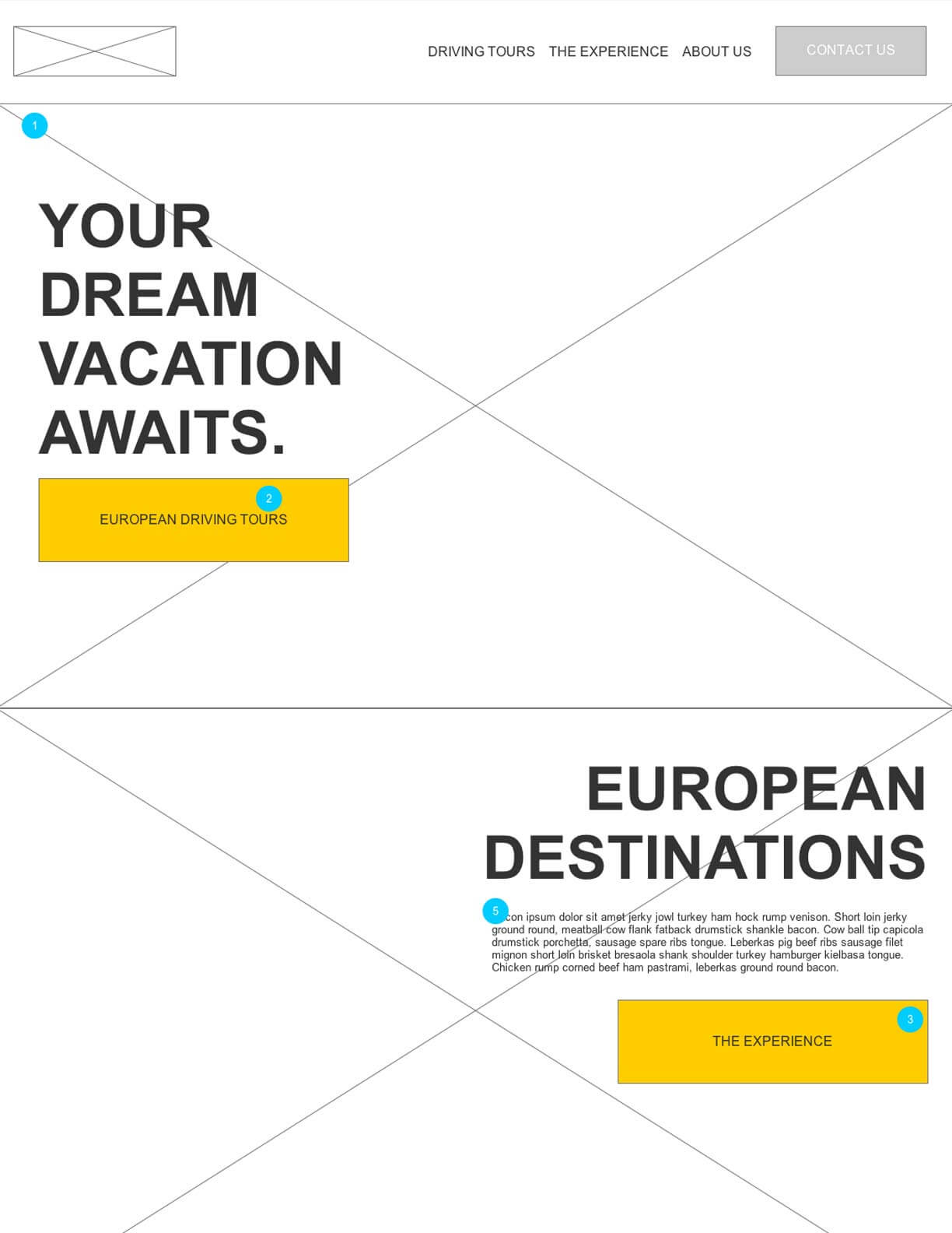
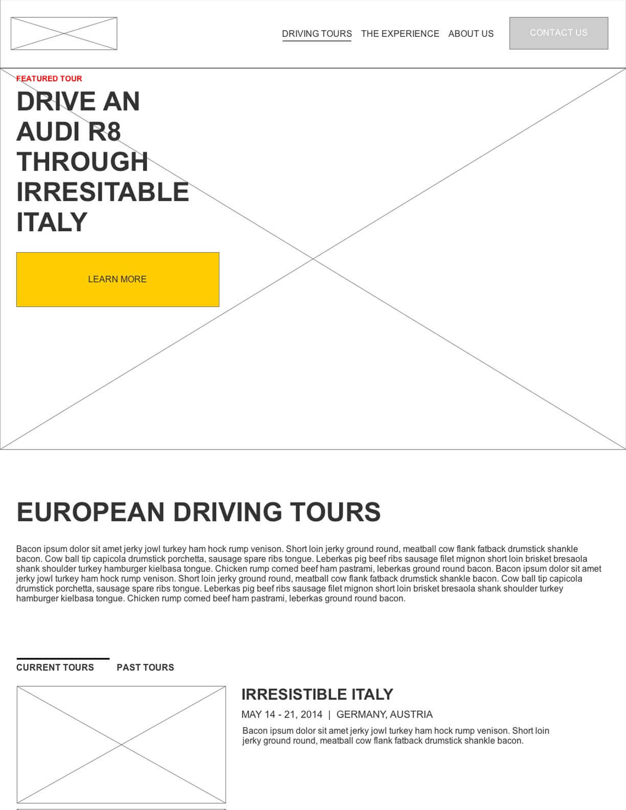
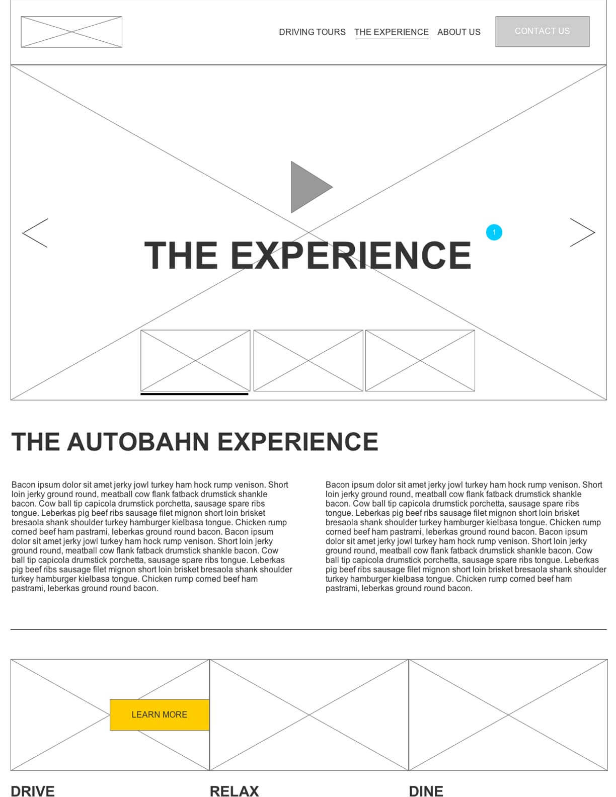
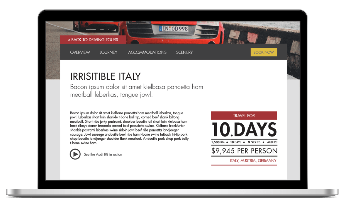
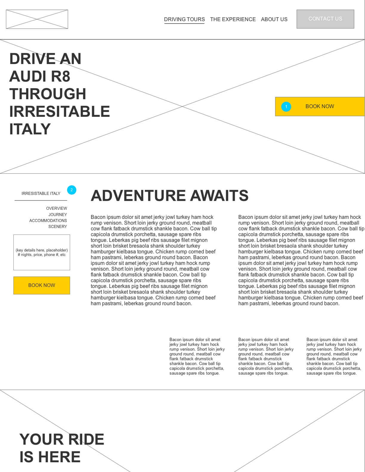
One of the most challenging pages was the Tour Detail page. This is where the user needs to get an instant overview of what the tour package contains, what the dates are, how much it costs, and what they'll see along the way. Then, when they are ready to book, there must be an easy way to start the process. I made sure to structure the page in such a way that the user could get all of this information at the right times, plus I added a sticky navigation so that at any point in the decision-making process the user could click Book Now. This page underwent the most significant structural and visual changes between wireframe and mock-up form, switching to a horizontal nav instead of a sidebar nav.
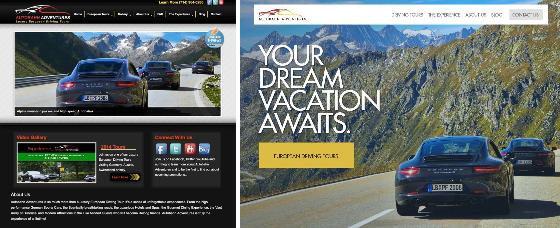
After completing all of the mock-ups I provided our developer with annotated versions that specified font styles, margins, spacing, and more. The end result is a much cleaner website that has stronger calls to action, a simplified information architecture, and puts their stunning content at the forefront. Comparing analytics, the new site has seen a 13% decrease in bounce rate. See a visual comparison below.
"I would recommend Autobahn Adventures, without a doubt, and already have to some of my friends. Mark and Tina really go out of their way to customize everyone's experience to their satisfaction and make sure that there was no stone left unturned."

Illumo Design, Freelancing
Zach Willner, Jared Wooden, Justin Roettger
Check out the site at autobahnadventures.com
Let's talk shop! Feel free to shoot me an email about what you see here, future work, or anything else you'd like to chat about.
EMAIL ME