UX DESIGNER
After joining the team near the end of NHL 14's development, I took it upon myself to solve a big design problem: the main menu's organization. With a candidate information architecture already in place, I worked with producers to figure out how to modify the architecture and the behaviour of the main menu to solve both user and business needs.
Tools: Axure, Photoshop, Pen & Paper
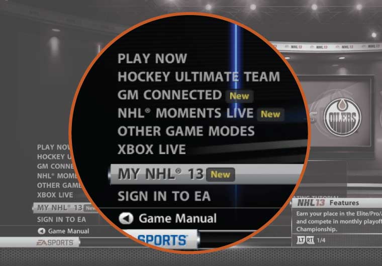 NHL 13
The organization of NHL 13's main menu featured items at the top level that could have been placed inside of subcategories. Additionally, the main menu mixed system functions, such as "Sign in to EA", with game modes, such as "GM Connected". Although featuring game modes at the top level made it more efficient to access those modes, it became difficult to understand the hierarchy of the objects within the game.
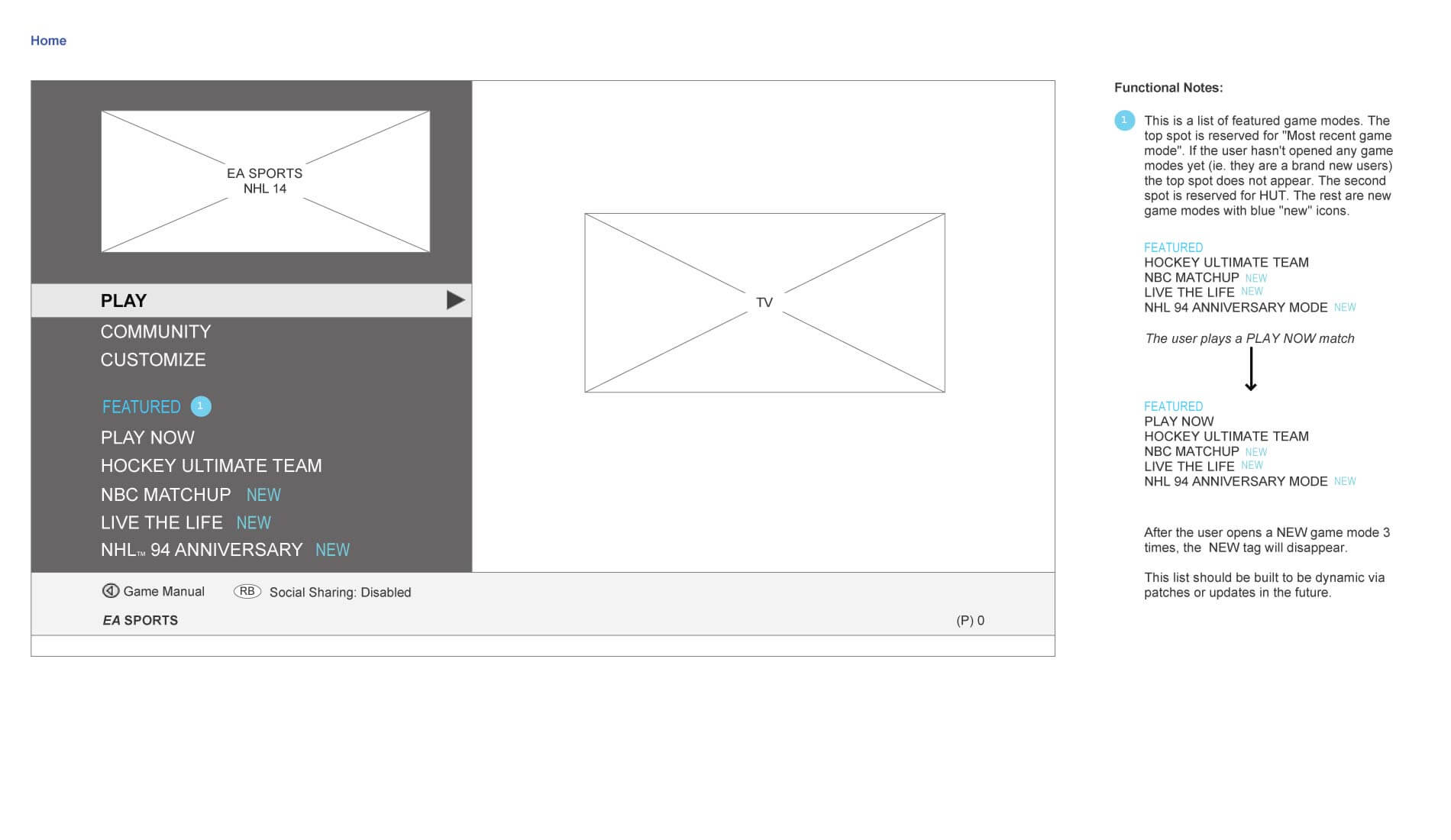
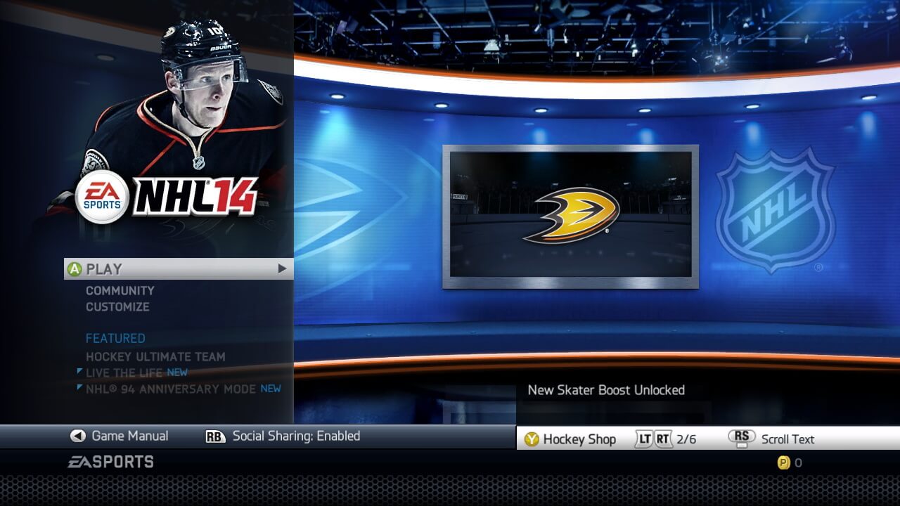
Through the use of "New" tags, game modes and features that were new to NHL 13 were clearly called out. This was important both for customers and reviewers, so that both types of users could quickly access new content. The challenge for NHL 14 was to create a main menu that featured new game modes but didn't break from a consistent information architecture.
I started by sketching two things: ideas for how to handle "New" items on the main menu, and ways to re-organize the game modes architecture. By collaborating with both interface designers and producers, we were able to arrive at the idea of "Featured" game modes that live separately from the main navigation structure.
The biggest architectural problem to solve was how to move Play Now one level up in the hierarchy so that users didn't need to select "Play > Play Now > Play Now" to play a single game. We decided to group all other single-type game modes into a category called "Quick Modes", which in this document is shown as "Single Game". This allowed us to put Play Now at the top level, such that the flow was streamlined to "Play > Play Now".
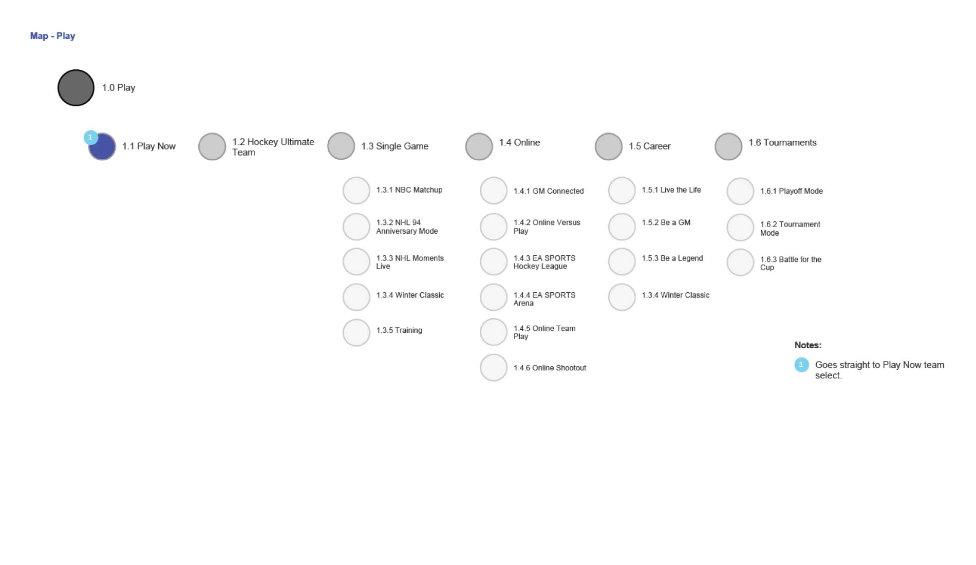
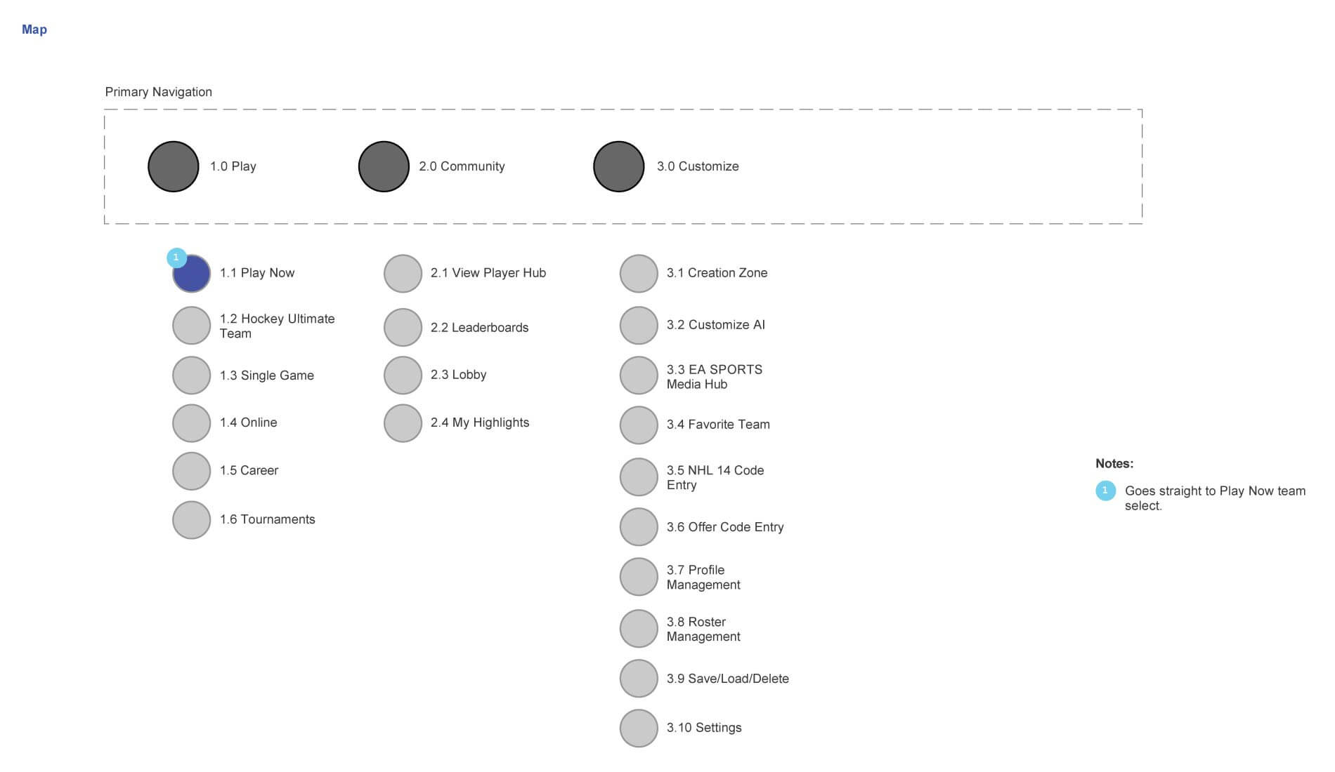
Before finalizing the modified information architecture, I created wireframes to explain the new behaviour of the proposed "Featured" category. As shown, it was designed to showcase new or important game modes but in a way that was clearly separate from the main navigation such as to avoid removing items from their proper place in the information architecture.
Usability studies revealed very few navigation issues related to the new Play, Community, Customize navigation. As intended, players and reviewers were able to easily identify and try new NHL 14 features, while benefitting from a much clearer information architecture. Additionally, this design aligned the game with other EA SPORTS titles such as FIFA 14 and MADDEN 25.
"Perhaps the best part of NHL 14, at least for noobs, is a simplified interface that features only the main mode choices on the front menu page. You can tweak just about any imaginable setting, from camera angles and controller layouts to automatic aiming and artificial intelligence levels, but all of that plumbing is wisely hidden under the virtual hood."
UX Designer, Electronic Arts
Jordan Girman, Ian Chan, Garrett Knights
Check out the game at easports.com
Let's talk shop! Feel free to shoot me an email about what you see here, future work, or anything else you'd like to chat about.
EMAIL ME