UX DESIGNER
NHL 15 was a huge challenge, as we set out to overhaul the UX for the entire game for the next console generation. I was responsible for shaping that UX, refining game mechanics, interpreting feedback from user testing, and working with gameplay engineers on in-game elements.
Axure RP, Omnigraffle, Quartz Composer, Photoshop, Illustrator, Perforce, Actionscript, Lua, Pen & Paper

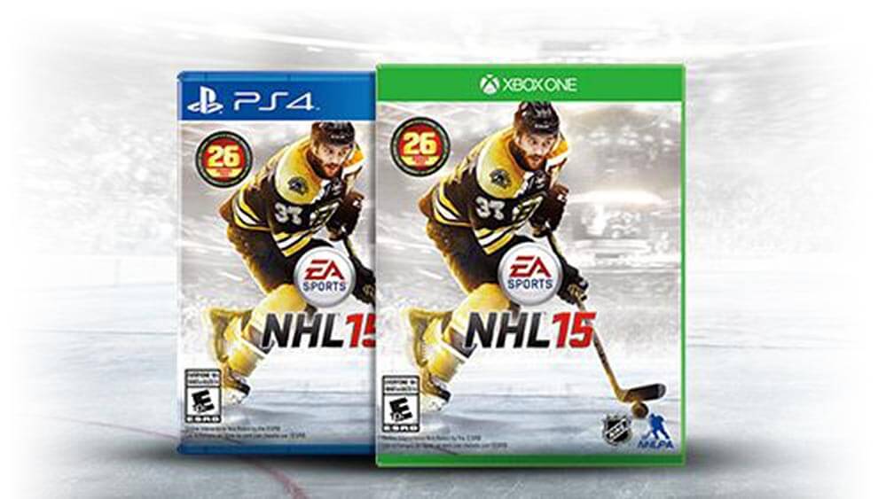
NHL 15 marked the first time that the game would launch on Xbox One and Playstation 4. Because much of the underlying technology was changing, we used this as an opportunity to re-design the UX for the entire game. The key to the re-design was maintaining depth for expert user personas, while streamlining key flows and providing shortcuts for novice personas.
Due to years of organic growth, the series accumulated information architecture inconsistencies. For NHL 14 we tackled the main menu; for NHL 15, the IA of the entire game was reconsidered and amounted to over 300 screens. Emphasis was put on ensuring clear, logical IA.
Prototyping became a key way to validate designs in high fidelity without involving specialized engineers. I employed tools like Hype and Quartz Composer to prototype animations, interactions, and screens.
The NHL series packs a lot of depth in game modes. Some game modes were not surfacing game mechanics as best they could. One of the primary goals of NHL 15’s UI development was to ensure that game mechanics were meaningful and were surfaced to the user at appropriate times.
Throughout the NHL 15 journey we engaged the services of EA’s User Experience Testing Labs to gain insight into how customers will play the game. Each game mode had at least three tests: a paper or wireframe think-aloud study, a mock-up or prototype study, and finally an in-game study either 1-on-1 or in a group session.
NHL 15's overarching Art Direction was Hyper-Realism. Lights should have blooms and flares, skates should leave distinct marks in the ice surface, glass should have visible scratches, and player jerseys should flow in the wind. The guiding principle for the UI was Glass set in a dark pre-game environment. Our tile-based UI mimics the look of glass with edge-lit glows.
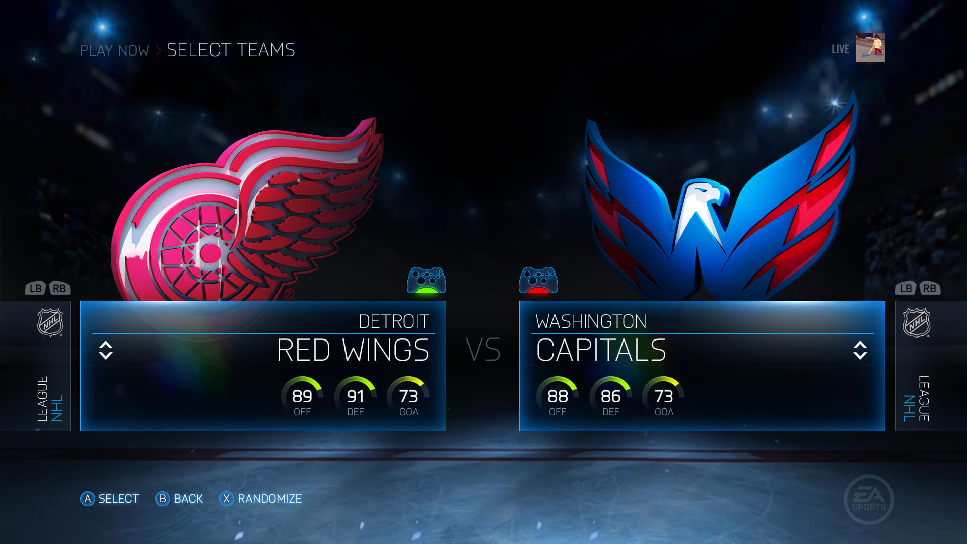
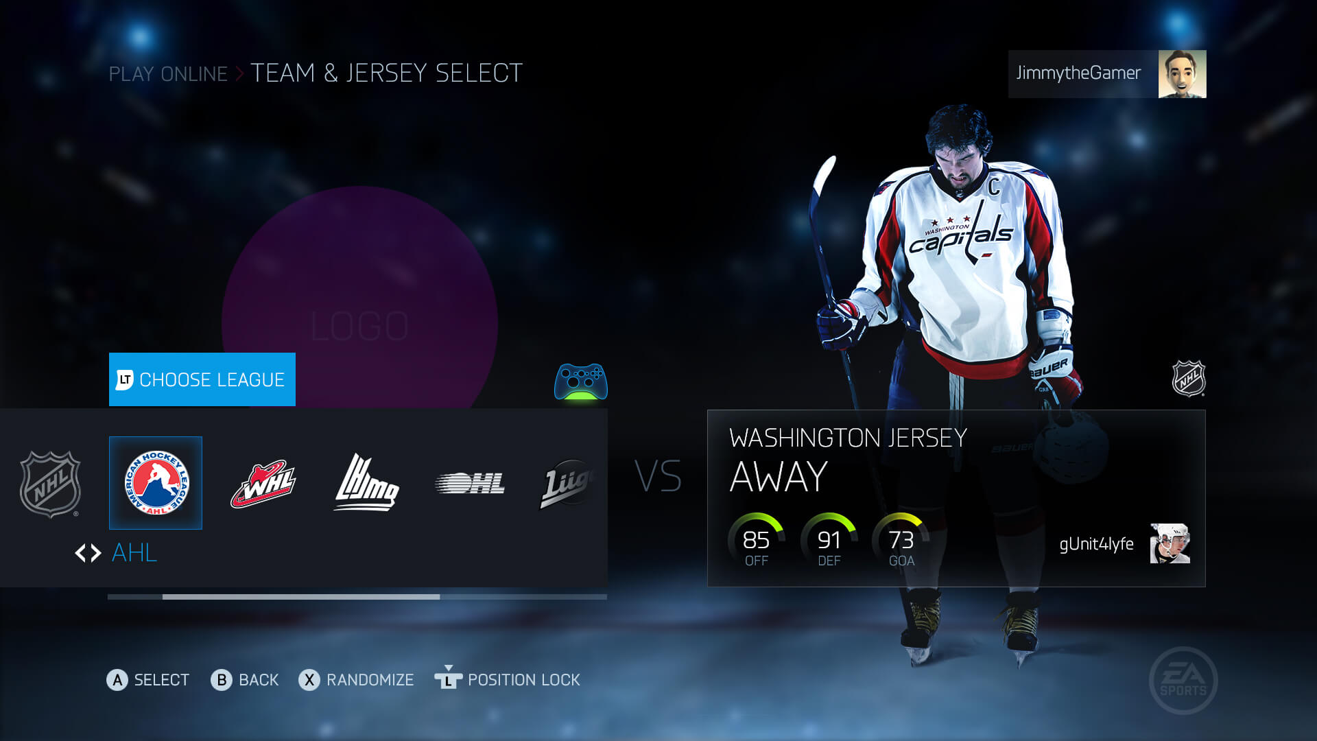
As one of the most commonly-used flows in the game, Play Now was my first stab at aligning the game with our new tile-based UI, removing friction from clumsy interactions, streamlining the flow, and iterating based on feedback. An artist mockup of the screen is shown below.
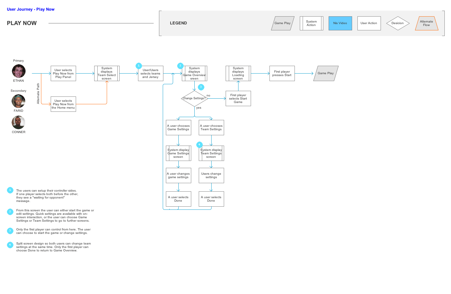
Early in the design process I tried a version of Play Now where users explicitly selected Home or Away sides before choosing teams, aligning us with the flow that FIFA uses and reducing ambiguity in the team selection process. Additionally, I wanted to improve the local multiplayer play experience so I designed screens relating to team settings to allow simultaneous 2-player input.
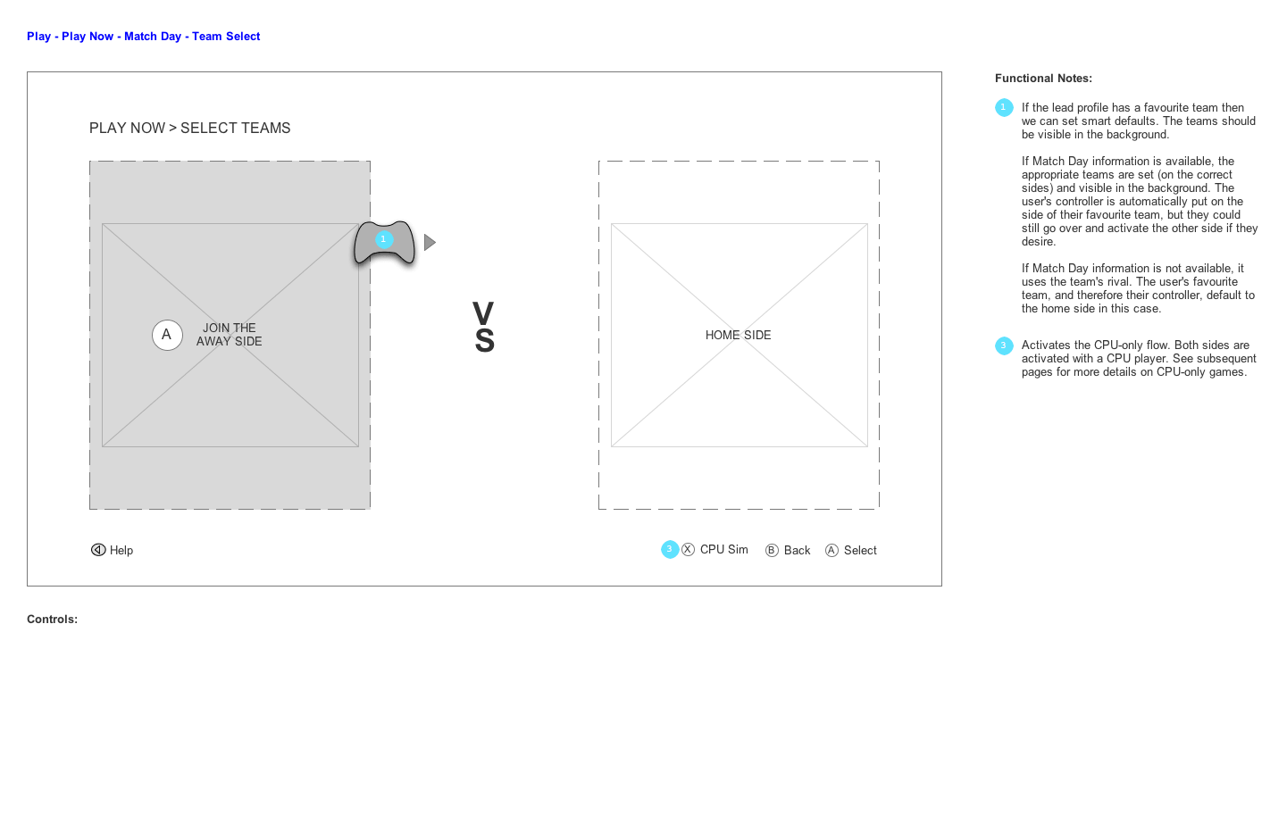
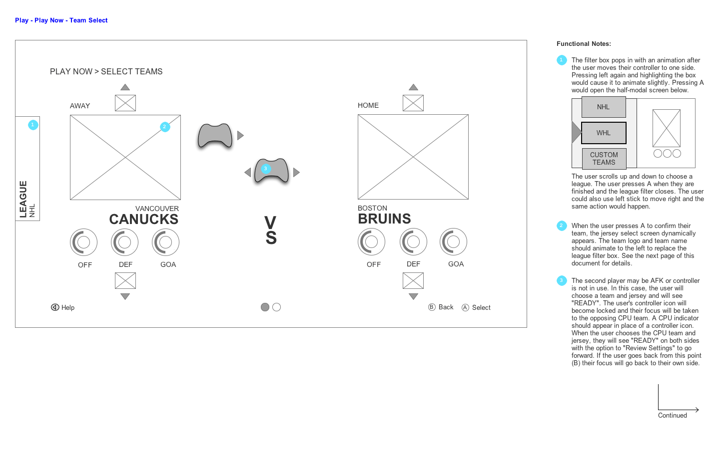
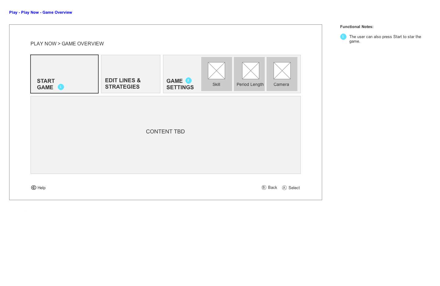
I re-worked the Play Now flow to allow both team and jersey selection at the same time, while hiding complex game settings behind one extra click from a “Game Overview” screen. This new screen shows just enough information to seem fun and useful without overwhelming new users - they can mash the Select button to get right into game.
The first round of testing for Play Now was done as a paper prototype with mock-ups. We had two key findings: people enjoyed explicitly choosing a side before going on to choose a team and jersey; and our first design for editing lines was causing confusion.
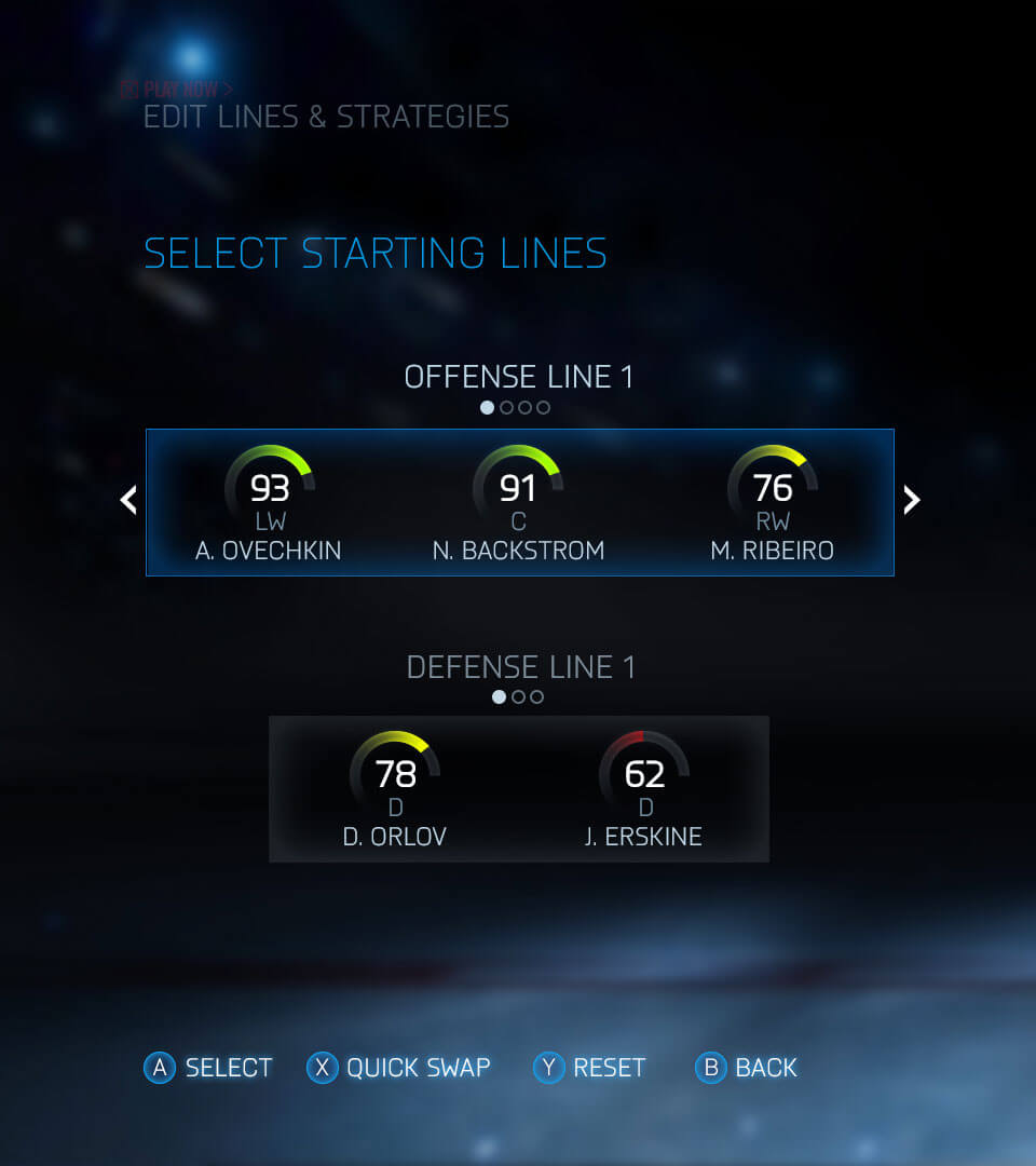
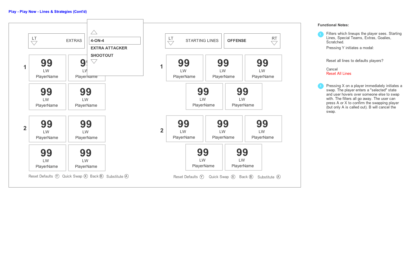
This early design for editing lines was not kept, although a similar design was re-purposed for the Starting Lines screen where users simply choose which line will start on the ice at the beginning of the game.
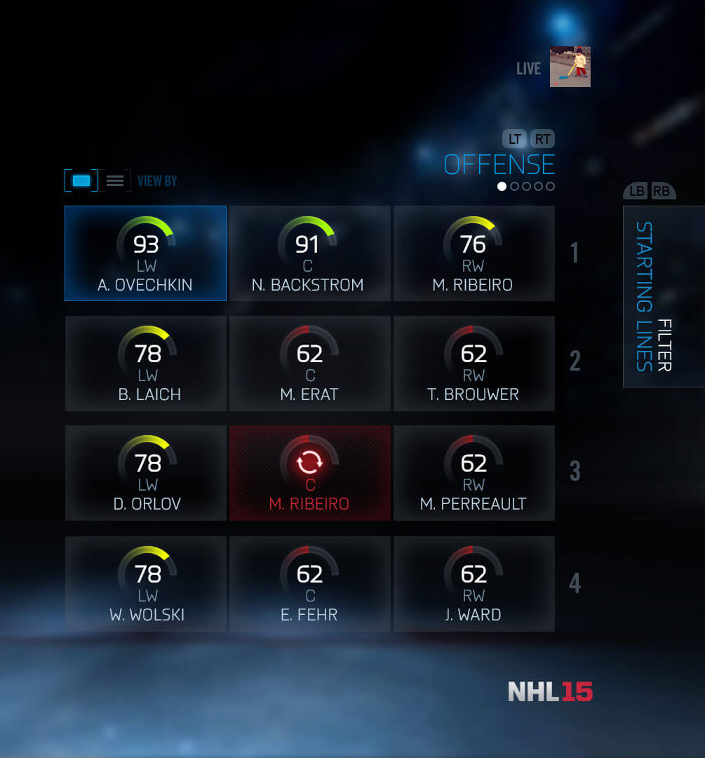
Users much preferred this version, which showed all members of a given type instead of showing players in a five-man unit. We put extra care into designing a quick-swap feature whereby a player can be swapped easily on the current screen from one spot to another.
The final designs present a streamlined flow that was suitable for both offline and online modes. The standard single player case can be button-mashed through, and complex settings are hidden behind a preview panel. Later in the development process, we modified the flow to display both 3D logos and 3D player models to accentuate the feeling of getting closer to gameplay and to reinforce Hyper-Realism.
Halfway through the game’s development, we took a critical look at our widespread use of on-screen navigation widgets. I then set out to prototype a better solution to get buy-in and validate the designs with our UX Testing Labs.
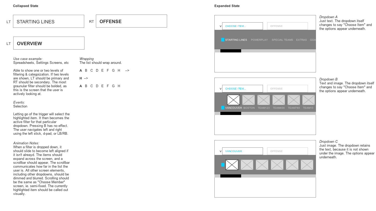
Historically, NHL used toggles with breadcrumbs for pagination purposes. However, their big weakness was that you couldn't see the titles of the available pages until you selected them. This meant users had to memorize most of the game’s information architecture.
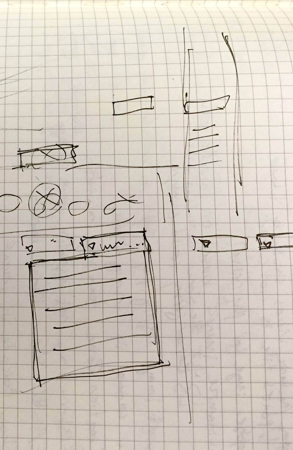
These initial sketches show various forms of dropdown menus: attached to the edges of the screen, vertical, horizontal, text-only, image-only, and more.
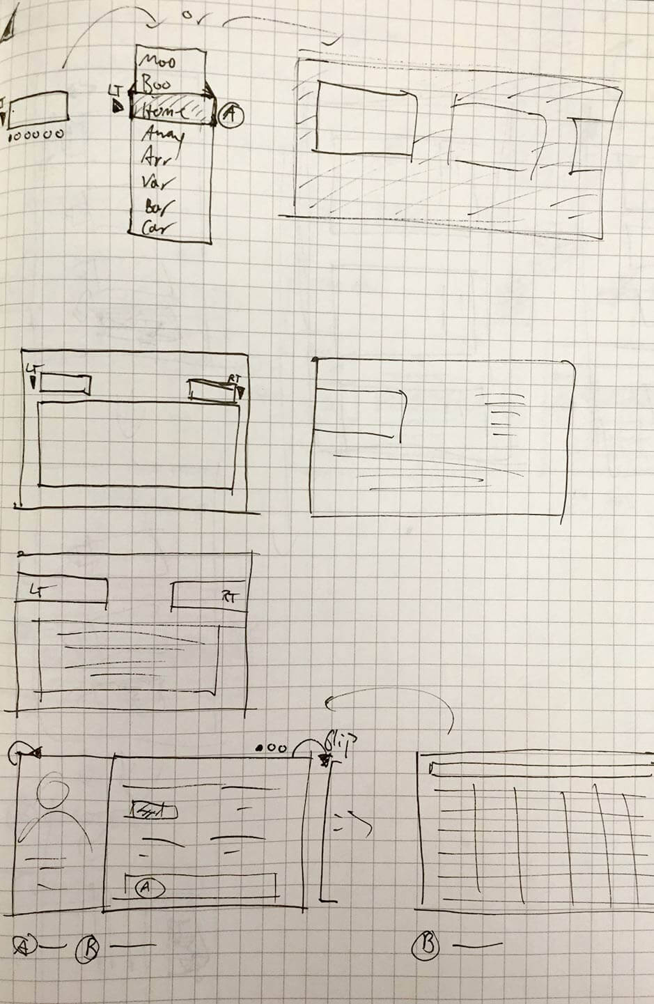
Here we explored the possibility of switching to a drop-down system. The user would hold down a button to see all of the widget’s available pages, navigate to the desired page name, then let go. This greatly improved the visibility of menu options. It had to be designed to work on any screen, so the dimensions and overlay effect were carefully considered.
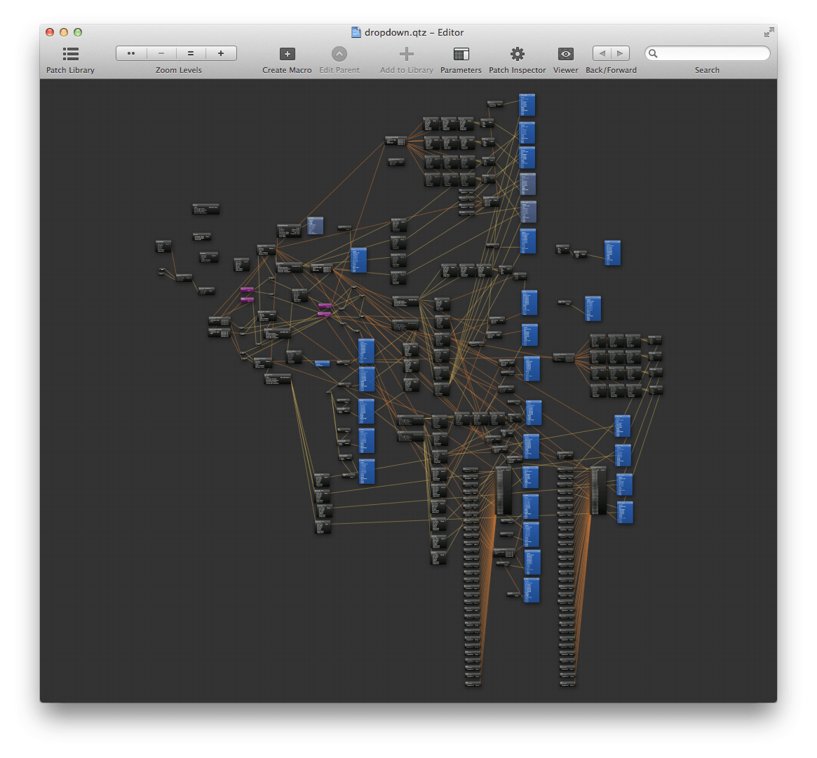
Because this was a non-trivial and widespread change to the game’s core navigation, I knew it needed a compelling prototype in order to get buy-in and in order to test it before implementation. I took the opportunity to learn Quartz Composer and create some custom patches to enable game controller input, building on the Facebook Origami plug-in. The prototype was an immediate hit and we were able to use it in a user testing session which gave us very positive feedback.
The drop-downs ended up being implemented game-wide and well-received in future testing sessions. They never impeded any users from completing their tasks, and revealed improved task efficiencies as well as an improvement in the discoverability of information, especially by new users.
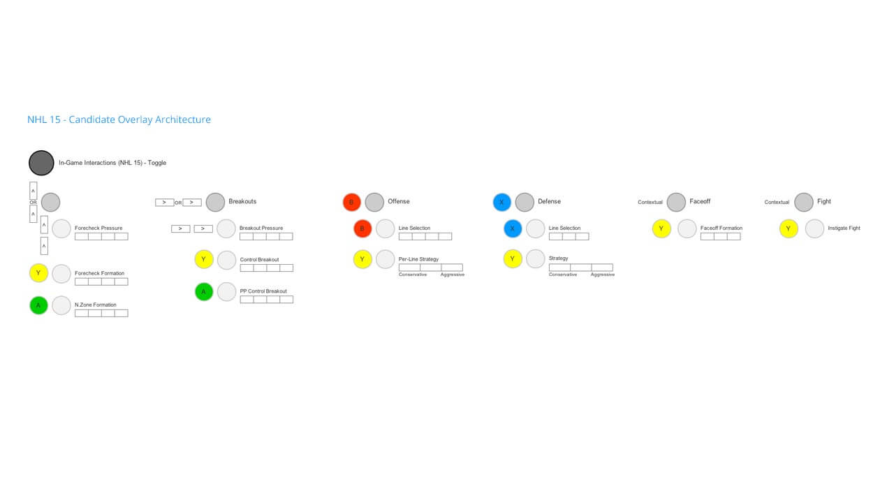
NHL gameplay features a line change and strategy system whereby players can make changes to how their team plays on the fly. We took a look at this system from a UX lens too, revamping its architecture and aesthetics to match the NBC broadcast package.
The in-game overlays needed to accommodate some new features made possible by the new generation of consoles. Additionally, we wanted to clean up a confusing information architecture and interaction method that had crept into the overlay system.
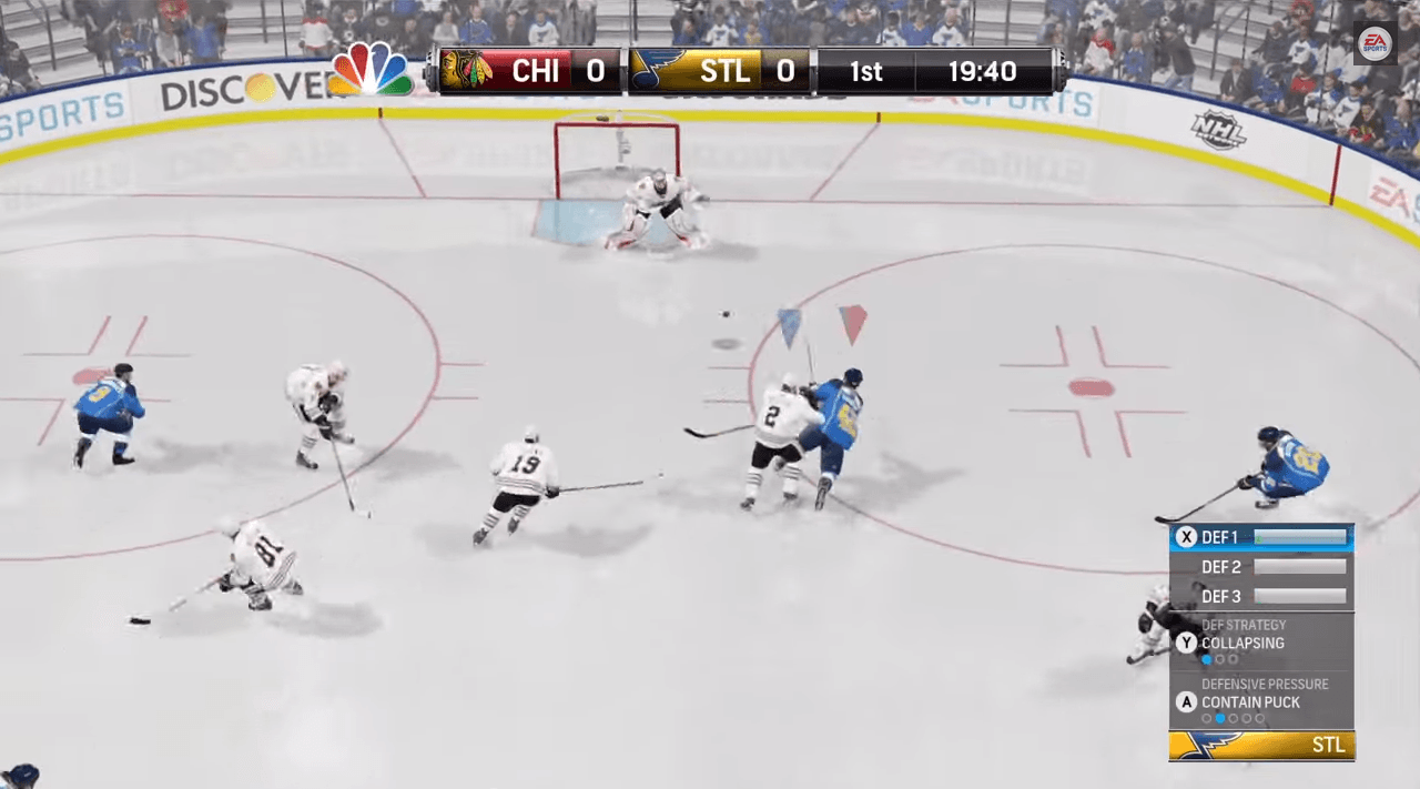
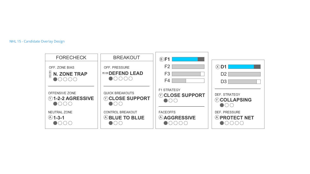
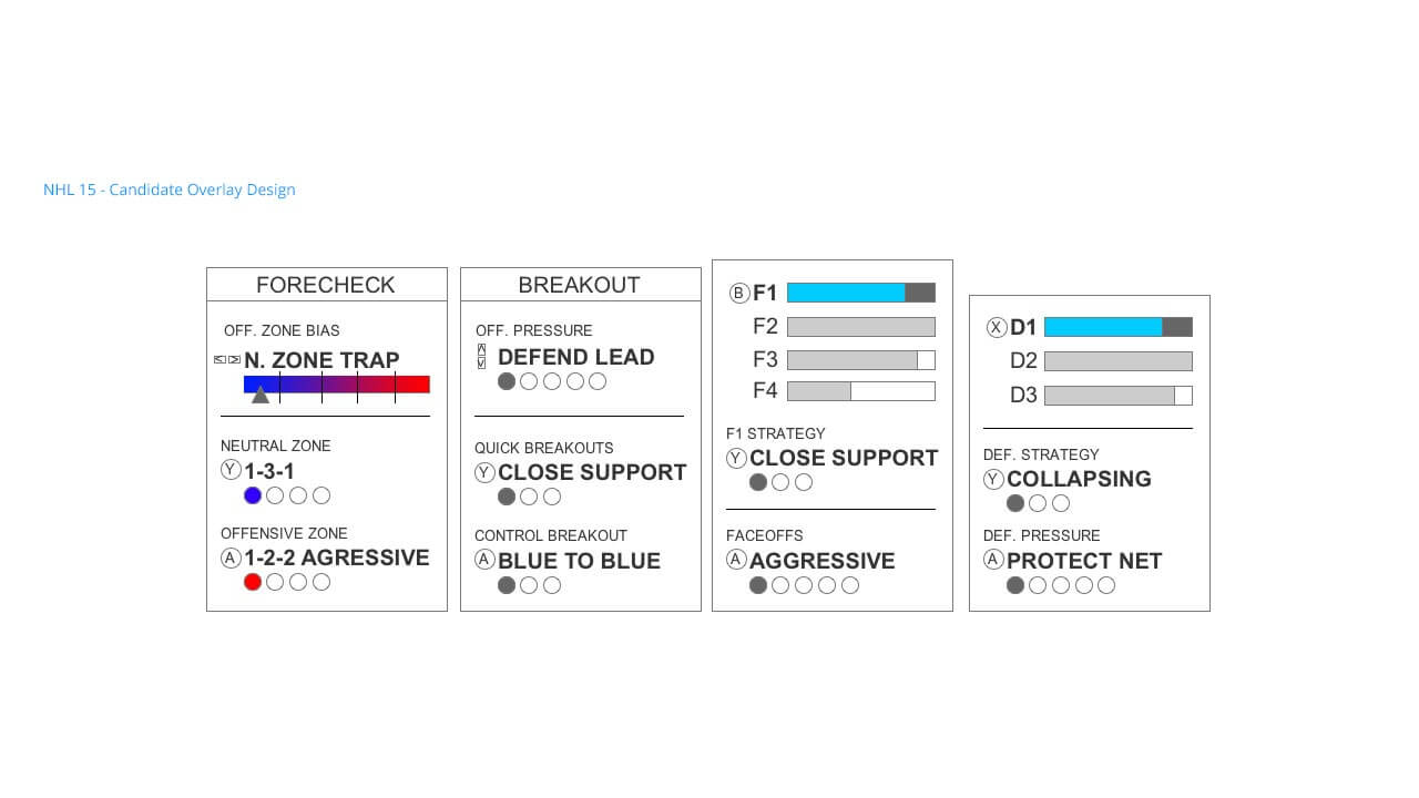
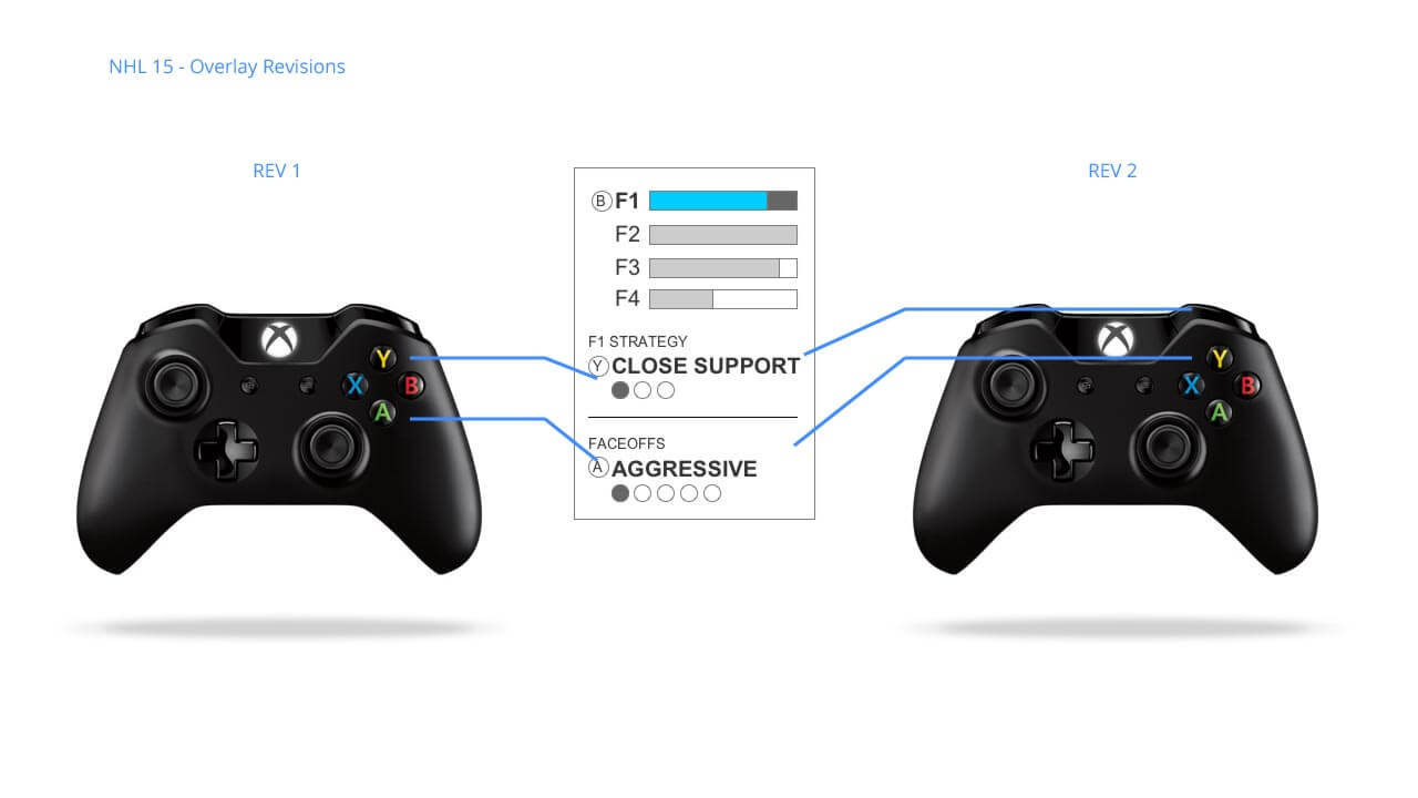
I worked closely with gameplay producers and programmers to lay out many different versions of controls and architectures for the overlays. We needed to make sure that they were accessible very quickly and unobtrusively during gameplay, so controller ergonomics were a big factor. Once we had a candidate design, shown below, I prototyped it using Quartz to prove out that the controls were comfortable. The new overlay design is consistent in that each overlay uses two secondary buttons for two secondary controls, plus a single button to operate the primary control and visibility of the overlay.
Before shipping the game, we realized that using the A button was interfering with skipping cutscenes. We refactored the controls in such a way that the spatial relationship between the buttons and on-screen elements was maintained. The first design had the Y and A buttons in use; the new design moved to RB and Y.
The new overlays have tested well and boast a visual upgrade over previous years. Each feature that uses overlays has consistent interactions, and new features were added to give expert users more control over their game experience.
The biggest win for NHL 15 was the refresh and creation of UX documentation to support all of the game's 300+ screens, including: user journeys, information architecture, wireframes, and prototypes. Our internal testing results indicate that critical information should be easier to find for both expert and novice users. Check out an end-user's impromptu walkthrough of some of NHL 15's UI below.
"Bravo...you gotta point out the times that they actually do good stuff..."
UX Designer, Electronic Arts
Jordan Girman, Ian Chan, Garrett Knights, Michael Doyle
Check out the game at easports.com
Let's talk shop! Feel free to shoot me an email about what you see here, future work, or anything else you'd like to chat about.
EMAIL ME